On this page
Elizabeth and Brenton came to me with a name, a Bible verse, and a mission. ALJLTY stands for “Always Let Jesus Live Through You.” Their nonprofit, Royale Ministry, is rooted in Mark 16:15: “Go into all the world and preach the gospel to the whole creation.” They wanted to build a brand identity that could carry that message on people’s backs. Literally.
No logo existed. No color palette. No products. Just conviction and a clear purpose. My job was to turn that purpose into something people could wear, share, and recognize.
This was a ground-up clothing brand identity design project in Colorado Springs. Everything from the wordmark to the packaging inserts to the WooCommerce store had to be created from scratch. The brand needed to resonate with the Christian community while standing on its own as quality apparel.
The Numbers That Matter
| What I Delivered | The Details |
|---|---|
| Logo System | Custom wordmark with cross motif, two variants (rugged and straight) |
| Apparel Line | T-shirts, crewneck sweaters, bucket hats, silicone wristbands |
| Packaging Suite | Package inserts, custom neck labels, product stickers |
| E-Commerce Store | Full WooCommerce build at aljlty.org with product photography direction |
| Brand Extras | Digital wallpapers, stock photo direction, web assets |
Works Well For: Is This Case Study Relevant to You?
This case study is most relevant if you:
- Are starting a faith-based brand from zero and need everything: logo, products, packaging, and an online store
- Want apparel that people actually wear outside of Sunday morning, not generic church merch
- Need a cohesive brand system that works across screen printing, embroidery, packaging, and web
- Are building a mission-driven brand where the visual identity needs to carry meaning without preaching
Industry fit:
- Faith-based merchandise and apparel brands
- Nonprofit organizations launching product lines
- Clothing and retail startups needing full brand identity
- Any mission-driven business where the brand needs to speak before you do
The Problem: A Message Without a Vehicle
Elizabeth and Brenton had the mission nailed down. Royale Ministry already served the Colorado Springs community. But ALJLTY was something different. It was the outward-facing arm of the ministry, a clothing brand that would put their message into the world through apparel that people would actually want to wear.
The challenge was specific. Faith-based apparel has a reputation problem. A lot of it looks like it was designed in Microsoft Word, printed on the cheapest blanks available, and sold at a folding table. That’s not what Elizabeth and Brenton wanted. They wanted something people would pull off a rack and think, “That looks good,” before they even read the message behind it.
They needed a complete brand system built from nothing. Logo, apparel, packaging, e-commerce. Every single piece. And it all had to feel authentic to their faith without alienating anyone who just appreciates well-made clothing.
The Insight: A Cross Hidden in Plain Sight
I spent time understanding what made ALJLTY different from the dozens of Christian apparel brands already out there. The answer came back to subtlety. Elizabeth and Brenton didn’t want to shout. They wanted the brand to start conversations, not end them.
That’s when the concept clicked. The letter T in ALJLTY could become a cross.
Not a cross slapped on top of the design. Not a cross floating next to the wordmark. The cross is the T. It’s built into the structure of the word itself. You see it when you look, and it rewards that second glance. The message is woven into the letterforms the same way faith is woven into the founders’ daily lives.
I chose the Eveleth typeface for its strong, blocky character. It has weight and presence without being aggressive. The distressed texture treatment (Elizabeth and Brenton’s preference) gives it a raw, handmade quality that feels like screen-printed fabric, not a corporate brand guide.
![]() The finished ALJLTY wordmark. The cross lives inside the T, built into the structure of the name itself.
The finished ALJLTY wordmark. The cross lives inside the T, built into the structure of the name itself.
What I Actually Built
The Logo: Two Variants for Every Context
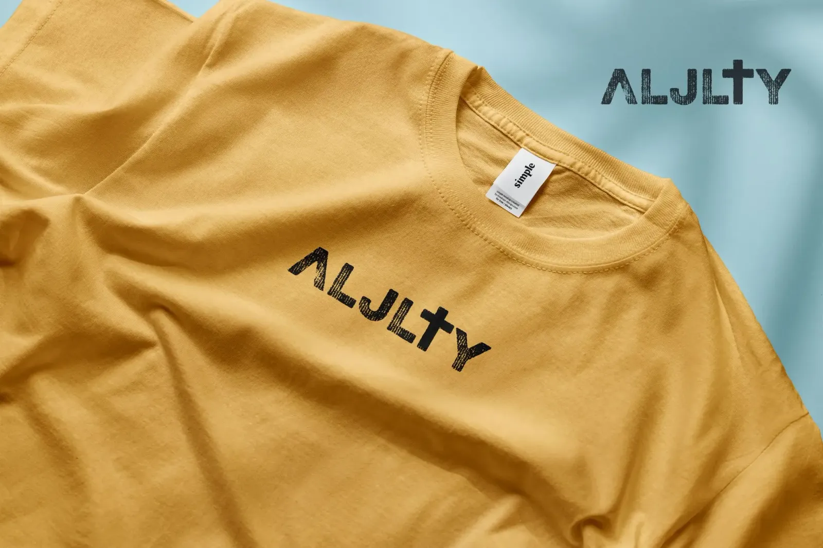
The distressed “rugged” version is the primary mark. Those vertical-line textures mimic the look of ink pushed through a screen print mesh. It feels handcrafted, like someone pressed it onto fabric by hand. That was intentional. Faith-based merchandise should feel personal, not mass-produced.
The “straight” variant uses clean, solid letterforms for situations where the distressed texture falls apart: small embroidery, favicons, or web headers. Same cross-in-T concept, just optimized for legibility at reduced sizes.
![]() Top: the rugged variant for apparel and large-format printing. Bottom: the straight variant for digital and small-scale applications.
Top: the rugged variant for apparel and large-format printing. Bottom: the straight variant for digital and small-scale applications.
The Apparel Line
This is where the brand comes to life. T-shirts in mustard gold with distressed black print. Crewneck sweaters in navy with white and heather gray with dark ink. Bucket hats. Silicone wristbands. Every piece was manufactured, photographed, and sold through the ALJLTY store.
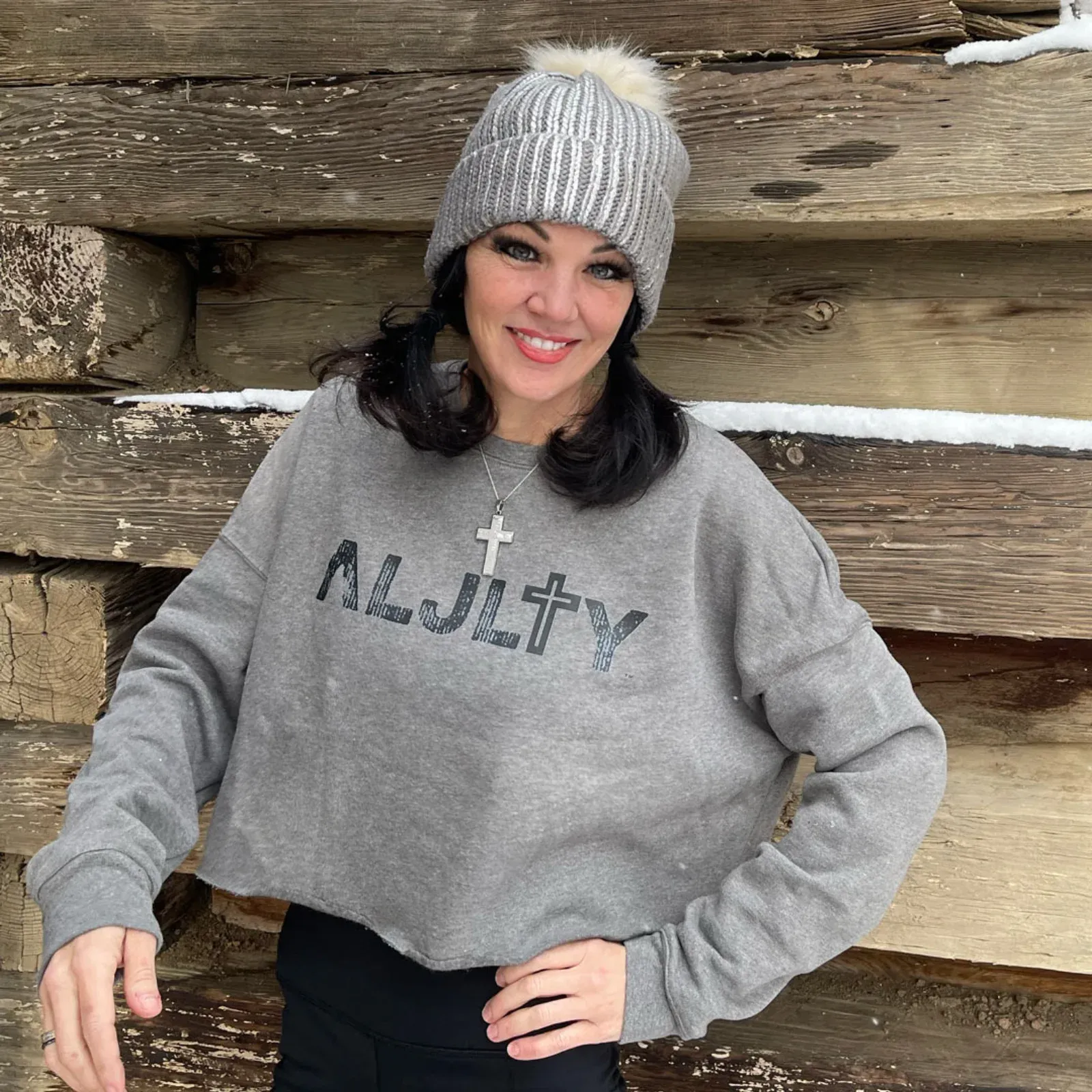 Elizabeth wearing the heather gray cropped crewneck. The distressed print translates beautifully to actual garments.
The apparel had to work as real clothing first and a faith statement second. Nobody wears a t-shirt because of its theology. They wear it because it looks good, fits well, and says something they connect with. The design decisions all served that priority: quality blanks, intentional color choices, and print techniques that hold up after dozens of washes.
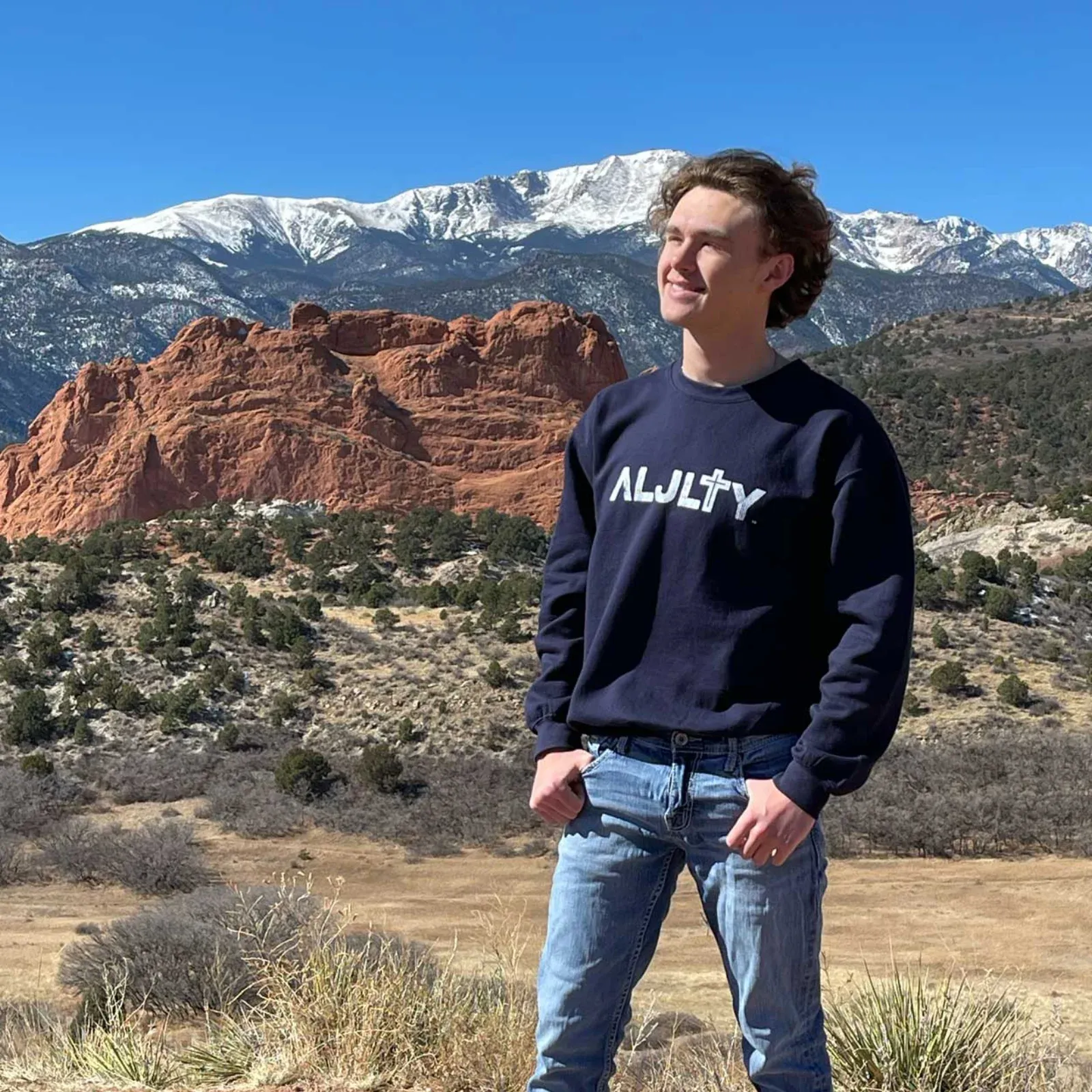 Brenton at Garden of the Gods in the navy crewneck. Colorado Springs is home base for Royale Ministry, and the landscape became part of the brand photography.
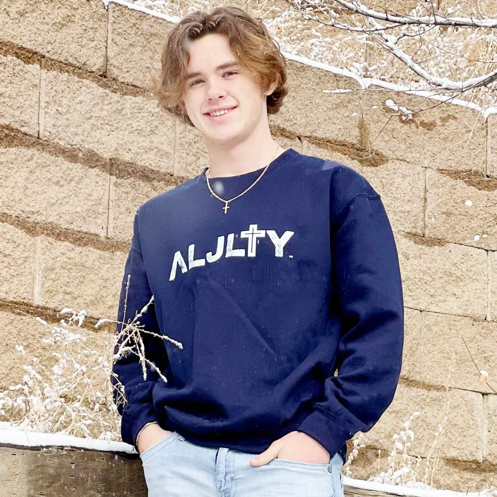 The navy crewneck with white distressed print against natural textures.
Brand Collateral and Packaging
Every product ships with a custom package insert. The design uses a church interior as the backdrop, copper-toned ALJLTY branding, and the Mark 16:15 mission statement. There’s a coupon code (“Mark1615”) and a QR code linking back to the store. It turns unboxing into a brand moment.
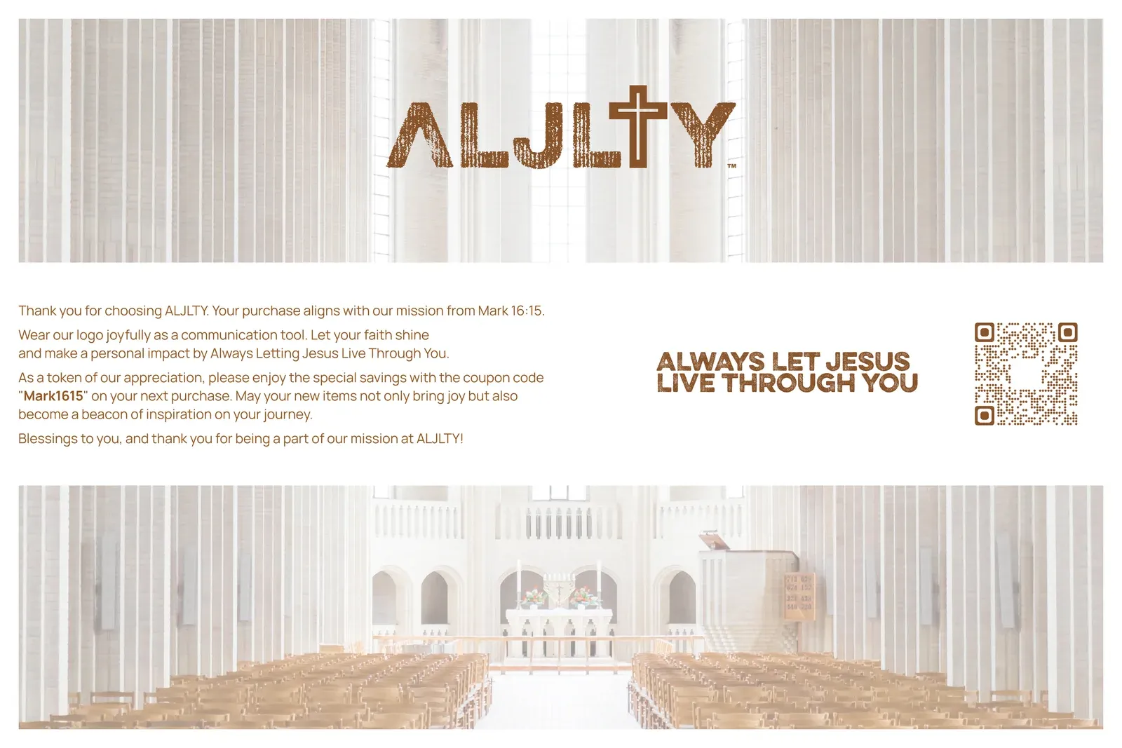 The package insert doubles as a mission statement. Copper tones, church backdrop, and a built-in reason to come back.
Custom neck labels replace the generic manufacturer tags. Black and white versions match whichever garment they’re sewn into. Product stickers go on the outside of packaging for a branded first impression before the box is even opened.
E-Commerce Store
I built the full WooCommerce store at aljlty.org. Product photography direction, product descriptions, favicon, web-optimized logo assets. The store needed to feel like a real brand from day one, not a side project bolted onto a ministry website.
Digital Brand Extensions
Brand wallpapers for phones and desktops give customers (and the founders) something to share beyond the apparel itself. The wallpapers use the copper ALJLTY mark over lifestyle photography: an open Bible, dried flowers, warm tones. They extend the brand into daily digital life.
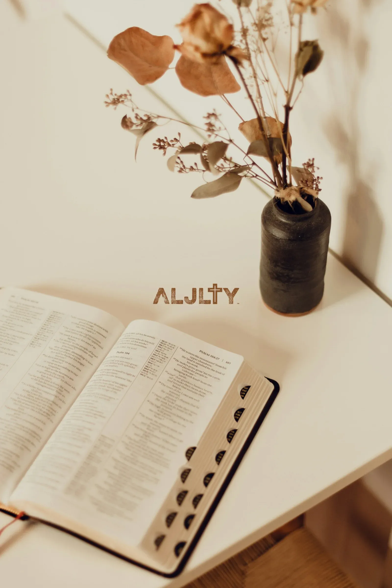 Brand wallpaper for digital distribution. The copper mark on lifestyle photography keeps ALJLTY visible between purchases.
The Color Strategy
The palette was built around the apparel, not the other way around. Mustard gold, navy, heather gray, black, and white form the garment color system. Copper tones handle the packaging and digital collateral.
Mustard gold stands out on a clothing rack without screaming. Navy reads as trustworthy and grounded. Heather gray adds a neutral option that pairs with anything. The copper accent on packaging and inserts adds warmth and a handcrafted feel that reinforces the brand’s personal, mission-driven character.
Every color was tested against the actual print methods being used. Screen printing on cotton behaves differently than digital printing on paper. The palette works across both because it was designed with production in mind, not just Photoshop mockups.
The Result
ALJLTY went from a name and a Bible verse to a fully operational apparel brand. Logo system, manufactured products, branded packaging, and a live e-commerce store. Everything Elizabeth and Brenton needed to put their message into the world was built, produced, and ready to ship.
The brand does exactly what it was designed to do: start conversations. The cross-in-T concept rewards the people who notice it. The apparel quality earns the right to be worn. And the packaging turns every order into a touchpoint for the mission behind the brand.
“The cross in the T was the moment everything clicked. It’s subtle, it’s intentional, and it’s exactly what ALJLTY is about.” — Elizabeth, ALJLTY / Royale Ministry
For a faith-based brand built from nothing in Colorado Springs, the visual identity removes the biggest barrier most startups face: looking like a startup. ALJLTY looks established because the brand system is complete, consistent, and considered.
About Apparel Branding
Frequently Asked Questions
Apparel branding has to survive production. Your logo needs to work as a screen print, an embroidery file, a woven label, and a web graphic. Colors need to translate from Pantone swatches to actual ink on actual fabric. I design with the manufacturing process in mind from day one so nothing gets lost between the mockup and the finished product.
That's exactly what happened with ALJLTY. No logo, no colors, no products. I built the entire brand identity, designed the apparel line, created the packaging, and set up the e-commerce store. Starting from zero actually gives more creative freedom because there are no legacy decisions to work around.
By designing apparel first and adding meaning second. The garment needs to look good on its own. People decide to wear something because of how it looks and fits, not because of its message. With ALJLTY, the cross is embedded in the typography itself. It's there for people who look for it, but the shirt stands on its own as a well-designed piece of clothing.
For ALJLTY, I designed package inserts with a church backdrop, copper branding, the mission statement, a coupon code, and a QR code. Plus custom neck labels in black and white variants, and branded product stickers. Every touchpoint between the customer opening the package and putting on the garment reinforces the brand.
Yes. For ALJLTY I built the full WooCommerce store at aljlty.org, including product photography direction, product descriptions, favicon, and web-optimized brand assets. The store needed to feel like a real brand from day one. I can also work with Shopify or other platforms depending on what makes sense for your situation.
A project at this scope (logo, apparel design, packaging, and e-commerce) typically takes 8 to 12 weeks from discovery to launch. The timeline depends on manufacturing lead times for the actual garments, how quickly you provide feedback, and the complexity of the product line. Simpler projects with fewer SKUs can move faster.
Not Ready Yet?
No pressure. Here’s how to know when it’s time to invest in your apparel brand identity.
Signs you need professional brand help:
- You have a great concept but no visual identity to bring it to market
- Your current apparel looks homemade or generic compared to the brands you admire
- Customers don’t recognize your products without being told who made them
- Your packaging doesn’t match the quality of what’s inside it
- You’re selling online but your store feels like an afterthought, not a destination
Questions to think through before we talk:
- What’s the mission or story behind your brand, and how should it show up visually?
- Who is your target customer, and what brands do they already wear?
- How many products are in your initial line, and what print or manufacturing methods will you use?
- Do you need just the brand identity, or the full build (apparel design, packaging, e-commerce)?
When the timing is right:
I’m happy to have an honest conversation about whether a brand identity project makes sense for your situation. Some brands need the full build from logo to e-commerce. Others just need one piece refined. I’ll tell you which.
If your message deserves to be out in the world but your brand isn’t carrying it there yet, a conversation will clarify what building it right would look like.
Case study by
Kristian Kreaktive
Founder & Lead Strategist at Digital Marketing Services
17+ years of experience helping small businesses grow their online presence through strategic SEO, web design, and branding.
More Digital Marketing Clients from Colorado Springs
 Featured
How a CPA Firm Captured 991 Top-3 Google Rankings and 175 AI Overview Citations
991 keywords in top 3, 175 AI Overview citations
Product Photography for Simple Body: 2,500+ Images Across 16 Months of Seasonal Campaigns
2,500+ professional images across 75+ products and 16 months of seasonal campaigns
 Featured
How a Forced Name Change Became the Best Thing That Happened to a Colorado Springs Epoxy Company
From invisible online to #1 across a 25-mile radius, fully booked, and expanding into commercial
More Branding Success Stories
When the Logo Tells the Whole Story: Clean Cut Renovations
One logo concept that expanded into a complete brand identity and custom website
How 50 Monthly Searches Turned Into a Fully Booked Consulting Business
From zero online presence to fully booked in 6 months, zero ad spend
Building a Brand That Matches the Craftsmanship
Rebrand that took them from local jobs to projects across 3 states


