On this page
Clean Cut Renovations is a kitchen and bathroom remodeling company serving Vancouver, Camas, and the surrounding Clark County area in Washington. Dan Snigur and his partner David run a small crew that handles everything from design consultation through final installation.
Their work was solid. Their brand was not.
The Numbers That Matter
| What We Delivered | The Details |
|---|---|
| Brand Assets | Logo, color palette, typography, brand guidelines, collateral |
| Website | Custom-designed multi-page site on WordPress/Elementor |
| Service Area | Vancouver, Camas, and Clark County, WA |
| Scope Expansion | Started as branding only, grew to include full website |
Works Well For: Is This Case Study Relevant to You?
This case study is most relevant if you:
- Run a renovation or remodeling business where your work quality outpaces your marketing materials
- Need both a brand and a website but aren’t sure which to tackle first
- Serve a local market and need a professional presence that builds trust with homeowners
- Have a company name with visual potential that hasn’t been explored in your branding
- Want a cohesive look where the logo, colors, and website all tell the same story
Industry fit:
- Kitchen and bathroom remodelers
- General contractors and renovation companies
- Home service businesses (HVAC, electrical, plumbing, painting)
- Any local trade business where trust and professionalism matter more than price
The Problem: Solid Work, Generic Brand
Here’s what Clean Cut Renovations was dealing with. See if any of this sounds familiar.
The brand was DIY and forgettable. No distinct visual identity. Nothing that communicated the quality of their actual renovation work. When homeowners compared options, Clean Cut blended into every other contractor in Clark County.
No visual story. The name “Clean Cut” has natural visual potential. A name like that should do heavy lifting in the brand department. But without intentional design, that potential was sitting untapped.
No website that matched their capability. First impressions for homeowners start online. If the website doesn’t look professional, the contractor doesn’t look professional. That’s how it works for local home services.
The Insight: The Name Does the Work
Before I opened any design tool, I sat with the name. Clean Cut Renovations. Two words that describe both the quality of their craftsmanship and a literal design concept.
What if the logo had a clean cut through it?
Not a metaphor. Not an abstract geometric shape that “represents precision.” An actual diagonal slice through the letterforms. The kind of concept that explains itself the moment you see it.
That’s the direction I took. And when Dan saw it, the reaction was immediate. He didn’t just approve the logo. He expanded the project. What started as a branding engagement became a full brand identity and custom website.
When a logo concept is strong enough to change the scope of a project, you know the design is doing its job.
What I Built
Working with eSEO Space on development, I designed the complete brand identity and website UI for Clean Cut Renovations.
The Logo: A Literal Clean Cut
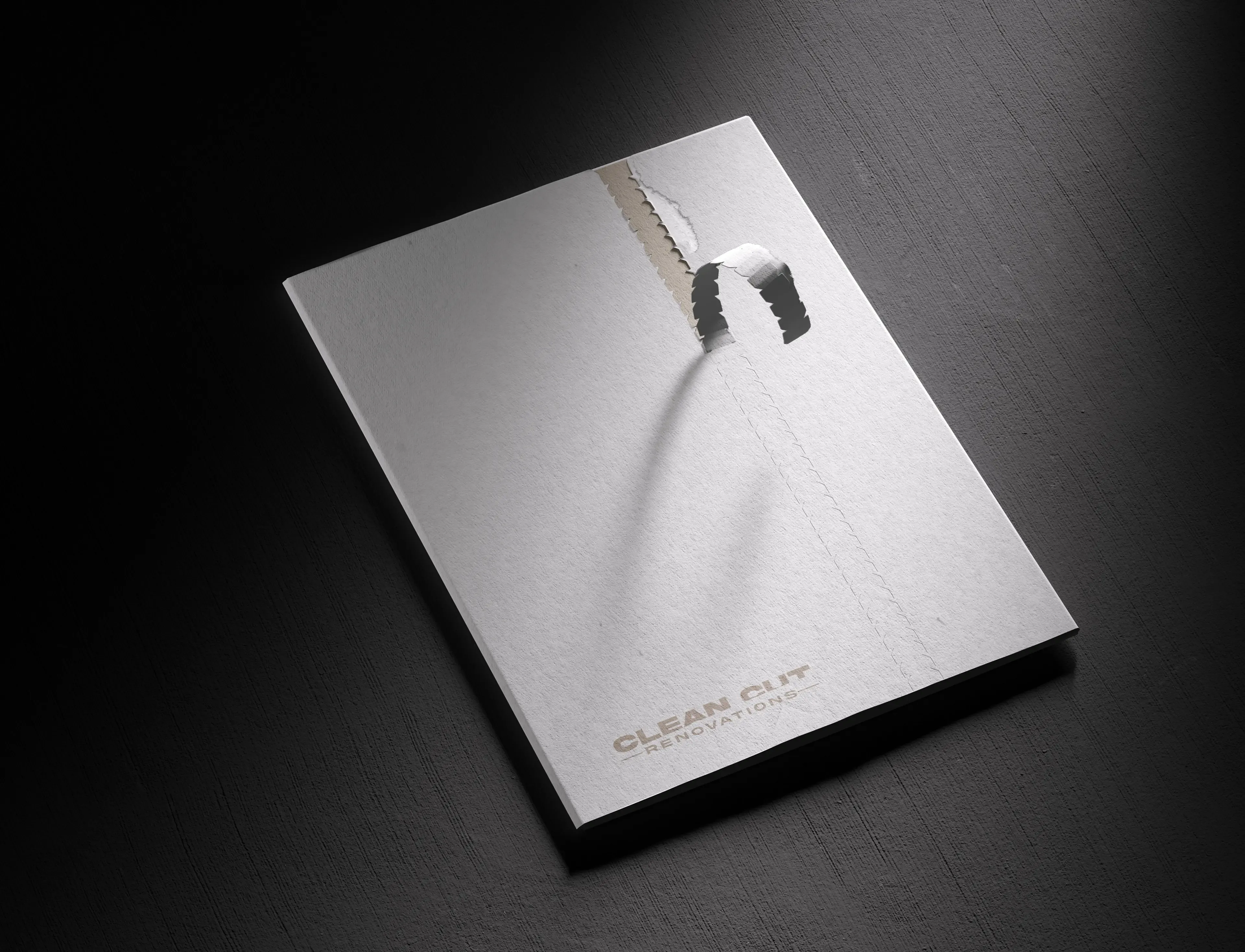
Every letter in “CLEAN CUT” has a diagonal slice running through it at a consistent angle. The cut creates a subtle shift in each letterform, like a blade has passed through the typography. It’s not a decorative flourish. It IS the name.
![]() The finished logo: a diagonal cut through every letterform. The concept explains itself.
The finished logo: a diagonal cut through every letterform. The concept explains itself.
“RENOVATIONS” sits below in a smaller, widely-spaced typeface flanked by horizontal rules. The contrast between the bold, cut letterforms above and the clean subtitle below gives the logo hierarchy without complexity.
The logo works at any scale. Building signage, business cards, truck wraps, website headers. The diagonal cut reads clearly whether the logo is 6 inches or 6 feet wide.
![]() Office wall mockup: the logo holds its own in a clean, professional environment.
Office wall mockup: the logo holds its own in a clean, professional environment.
Color Palette: Teal and Warmth
![]() Two primary color variations: dark teal for authority, warm brown for approachability.
Two primary color variations: dark teal for authority, warm brown for approachability.
The primary palette pairs a deep dark teal with a warm brown and cream. The teal communicates professionalism and trust (important for a contractor handling major kitchen and bathroom remodels). The brown adds warmth and craft. Together, they feel premium without being cold or corporate.
These colors work on screen and in print. Job site signage, vehicle wraps, social media, and the website all pull from the same palette.
Brand Collateral: Extending the Cut
 The brand collateral uses a torn paper effect, extending the “cut” concept into physical materials.
The collateral takes the cut concept further. The brand folder features a torn paper effect that peels back to reveal the logo underneath. It’s the same idea (something being cut or separated) applied to a different medium. The concept stays consistent without repeating the exact same visual trick.
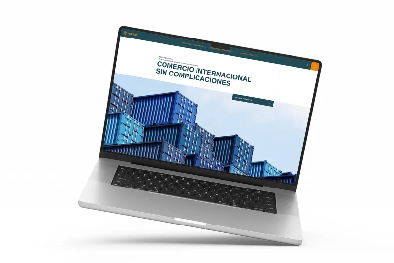
The Website: Carrying the Concept Through
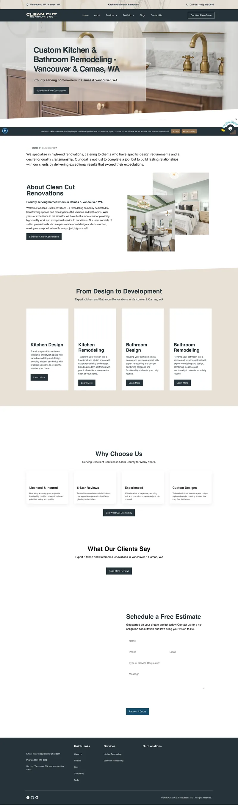

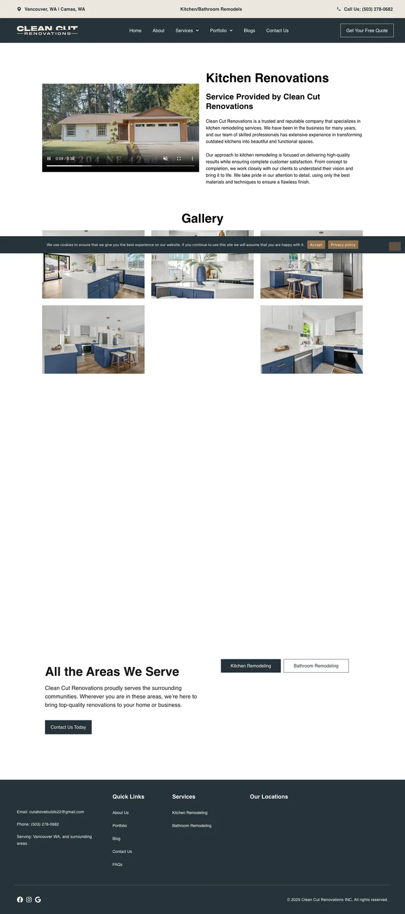

The website I designed carries the brand’s angled motif throughout. Section dividers use diagonal lines instead of straight horizontal breaks. The dark teal anchors the header, key sections, and footer, while cream and white keep the content areas open and readable.
Homepage structure. The hero features a full-width kitchen photograph with the headline “Custom Kitchen & Bathroom Remodeling” and a clear call to action. Below that, an about section introduces the team, followed by four service cards (Kitchen Design, Kitchen Remodeling, Bathroom Design, Bathroom Remodeling), trust signals, testimonials, and a contact form.
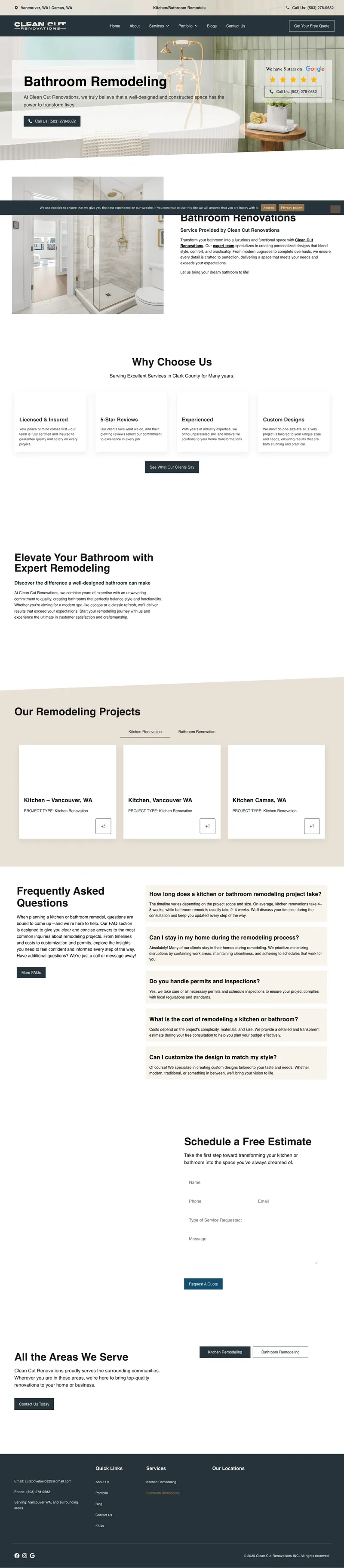
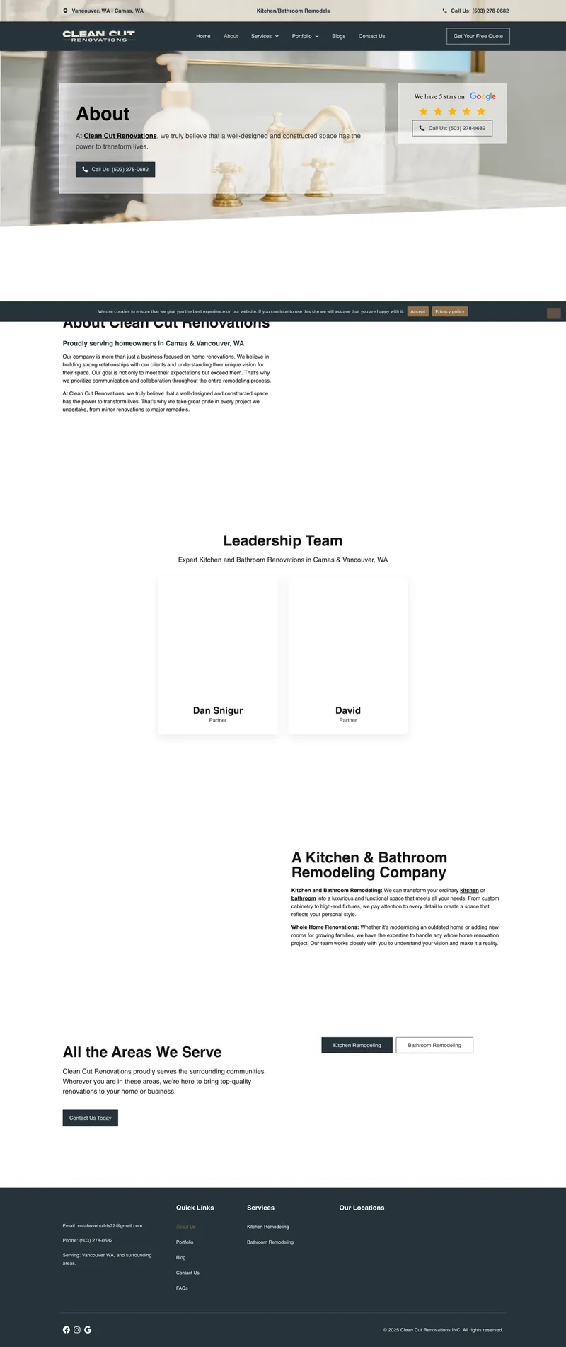
Service pages. Each service gets its own page with dedicated project photos, descriptions of the process, and a curated gallery of completed work. The pages follow the same visual structure so homeowners can explore without getting lost.
Trust signals built in. Licensed and insured badge, 5-star reviews callout, years of experience, and custom design emphasis. For homeowners hiring a contractor to remodel their kitchen, these details matter before they’ll pick up the phone.
The contact form is a conversion tool, not decoration. “Schedule a Free Estimate” with fields for name, phone, email, and project details. No barriers. A homeowner can request a consultation in under 30 seconds.
eSEO Space handled the WordPress/Elementor development, turning my designs into a fast, responsive, production-ready site.
The Result
One logo concept changed the entire project.
Dan and David came in looking for a brand identity. When they saw the diagonal cut concept, they knew it needed to carry through to the website. The concept was strong enough that expanding the scope felt obvious, not like an upsell.
That’s what good design does. It makes the next step feel inevitable.
Clean Cut Renovations now has a brand that works as hard as they do. The logo communicates their name and their standard of work in a single visual. The website presents them as the professional, trustworthy remodeling team they actually are. And every piece (from the business card to the contact form) tells the same story.
About Branding for Contractors
Frequently Asked Questions
Yes, if you want to compete for homeowners who care about quality. A homeowner choosing between three contractors for a $40K kitchen remodel will notice which one looks professional before they read a single review. Custom branding doesn't guarantee you win the job, but generic branding can lose it before you get a chance to bid.
Logo and brand identity first. Always. Your website is built on your brand foundation: the colors, the typography, the visual language. If you build a website without a solid brand, you'll end up rebuilding it once the brand is established. Clean Cut Renovations started with branding and expanded to the website because the brand direction informed everything the site needed to be.
For Clean Cut Renovations, it included logo design, color palette, typography system, brand guidelines, and collateral. The specifics depend on your business, but the goal is always the same: a visual system that's consistent across every touchpoint. Your truck, your website, your business card, your estimate templates. Everything should look like it comes from the same company.
Color and tone. Corporate brands tend toward cool blues and grays. For contractors, I lean into warmer palettes that feel approachable while still communicating competence. For Clean Cut, the warm brown alongside the dark teal keeps the brand grounded. The logo has a bold, modern feel without being sterile. That balance between professional and personal is where most contractor brands fall short.
It happens more often than you'd think. A strong brand concept creates momentum. Once a client sees how their business could look with intentional design, they want that vision carried through to every customer touchpoint. The website is usually the most visible one. Clean Cut Renovations is a perfect example: the logo concept was so clearly translatable to web design that expanding the scope was the natural next step.
A combined brand identity and website design project typically takes 6-10 weeks. The brand phase (logo, colors, typography, guidelines) comes first and usually takes 3-4 weeks. The website design phase builds on that foundation and adds another 3-6 weeks depending on page count and revision rounds. Trying to do both simultaneously usually leads to rework.
Not Ready Yet?
No pressure. Here’s how to tell when professional branding becomes a priority.
Signs your brand is holding you back:
- Homeowners are surprised by the quality of your work after visiting your website (they expected less)
- You’re competing on price despite delivering better results than your competitors
- You avoid handing out your business card or directing people to your website
- Your brand looks like every other contractor in your area
- You’ve outgrown the logo your cousin’s friend designed years ago
Questions to think about before we talk:
- Does your current brand reflect the quality of your finished projects?
- Are you losing bids to contractors with worse work but better marketing?
- Is your company name memorable? Does your visual identity match it?
When the timing is right:
I offer a free consultation. No obligation. Just an honest look at whether a branding investment makes sense for your situation.
Some businesses need a full rebrand. Some just need a better website. Some need both. I’ll tell you what I actually think, even if the answer is “you’re fine for now.”
But if your brand is actively working against you, a conversation will clarify what fixing it looks like.
Project Gallery


Case study by
Kristian Kreaktive
Founder & Lead Strategist at Digital Marketing Services
17+ years of experience helping small businesses grow their online presence through strategic SEO, web design, and branding.
In collaboration with
eSEO Space
Design & Development
This project was created in collaboration with eSEO Space, combining our strategic design approach with their development expertise to deliver a complete brand and web package.
Learn more about our partnershipMore Branding Success Stories
Product Photography for Simple Body: 2,500+ Images Across 16 Months of Seasonal Campaigns
2,500+ professional images across 75+ products and 16 months of seasonal campaigns
 Featured
Building a Faith-Driven Apparel Brand from Five Letters
Complete brand identity, apparel line, and e-commerce store launched from scratch
How 50 Monthly Searches Turned Into a Fully Booked Consulting Business
From zero online presence to fully booked in 6 months, zero ad spend


