


On this page
TL;DR
Heist Covers is a Las Vegas premium phone case brand that launched with zero visual identity into a brutally competitive market dominated by brands like Casetify and Nomad. I built the entire brand from scratch: a custom crowned lion mascot holding a key (tying luxury positioning to the “heist” theme), a full logo badge in an octagonal frame, a navy-and-gold color system, and gold foil packaging specs. The result is a brand that looks established from day one, removing the “new company” disadvantage in a market where first impressions determine whether customers give you a chance.
Heist Covers needed to go from nothing to premium. No existing logo. No color palette. No brand guidelines. Just a name, a product category (phone cases), and a goal: look like the kind of brand people pay more for.
I built the entire brand identity from scratch. The result is a brand that feels established, exclusive, and memorable, even though the company was brand new when we started.
The Challenge: Starting From Zero in a Crowded Market
Phone cases are a brutally competitive space. Amazon alone lists thousands of options. Most of them compete on price, which means most of them look disposable. Cheap photography, generic logos, forgettable packaging.
Heist Covers wanted the opposite. They wanted to sit alongside brands like Casetify and Nomad, not fight for attention in the bargain bin. But they had no visual identity at all. No brand assets. Nothing to build on.
The challenge was clear: create a brand identity that communicates luxury and exclusivity for a company that didn’t exist yet in the market. Every design decision had to punch above its weight because there was no reputation, no customer base, and no track record to lean on.
First impressions would be doing all the heavy lifting.
The Concept: A Crowned Lion With a Key
The client’s name, “Heist Covers,” has a built-in tension between two ideas. There’s the heist angle (bold, daring, a little mysterious) and then there’s the product reality (premium phone cases that need to feel high-end, not gimmicky).
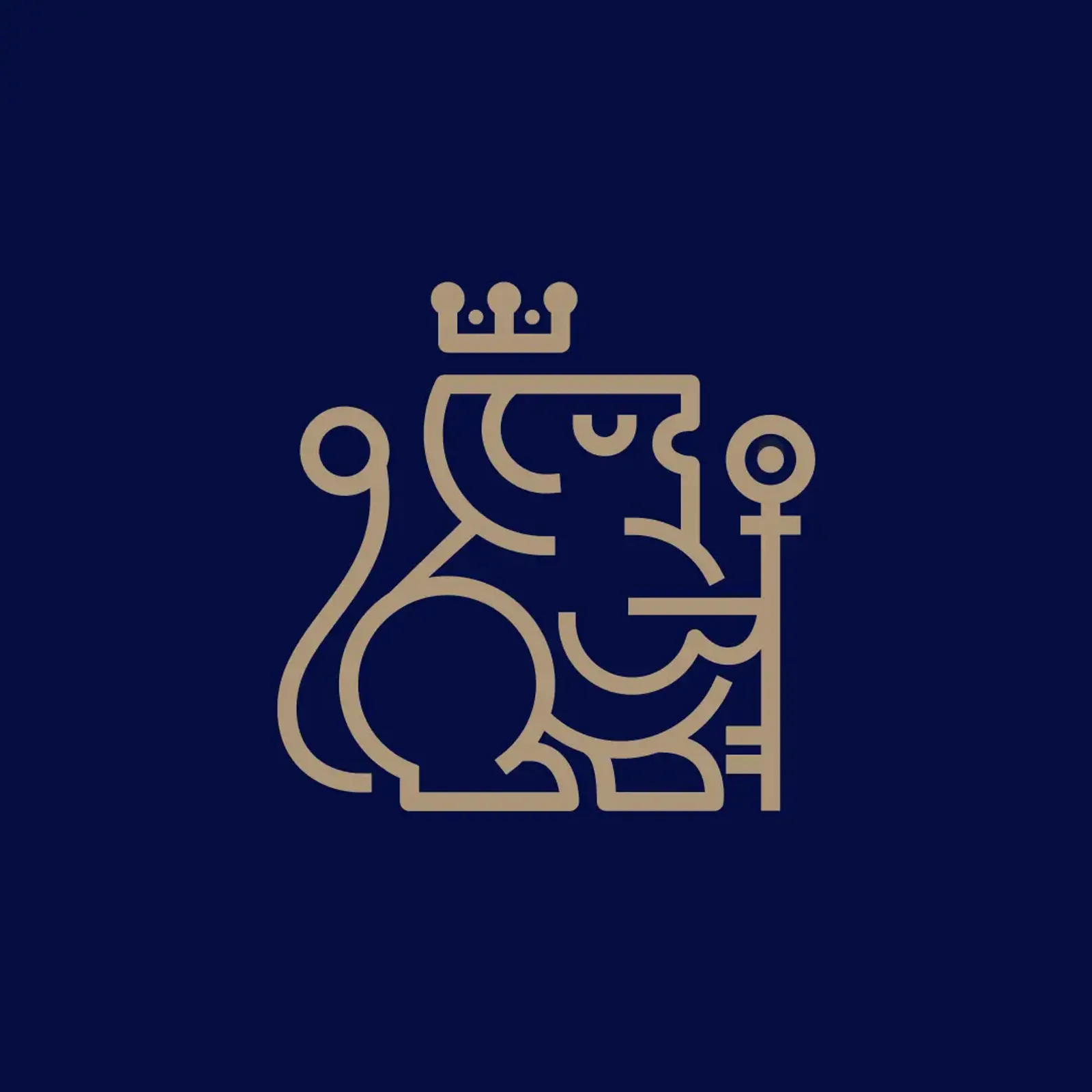
I developed a mascot concept that plays on both themes at once: a crowned lion holding a key.
The lion communicates royalty, authority, and confidence. That handles the luxury positioning. The crown reinforces the premium angle. And the key ties directly to the heist theme, because what’s a heist without a key?
 The crowned lion mascot: gold line art on deep navy. Detailed enough to feel premium, clean enough to scale from a favicon to packaging.
The combination doesn’t feel like a joke or a gimmick. The lion with a crown and key reads as “exclusive access” rather than “cartoon burglar.” Elegant and mysterious at the same time.
That dual meaning was the entire foundation of the brand.
What I Built
The Mascot Icon. A custom-illustrated crowned lion rendered in gold line art on deep navy. The geometric style gives it a modern feel while the details (the mane, the crown, the key) reward a closer look. It works as a standalone icon for favicons, social avatars, and embossing.
The Logo Badge. The full logo sits inside an octagonal frame with “HEIST COVERS” set in elegant serif typography below. The octagonal shape adds a badge-like quality (think luxury watchmakers, heritage brands, exclusive clubs).
Color System. Deep navy blue paired with gold. Navy anchors the luxury feel. Gold adds warmth and signals exclusivity without being flashy. The palette works across digital screens and physical materials without losing impact.
Physical Applications. The gold foil treatment on dark navy paper is where the brand really comes alive. Foil stamping catches light differently depending on the angle, giving printed materials a tactile quality you can’t replicate on screen. Business cards, packaging inserts, and marketing collateral all use this treatment.
![]() The complete logo badge in gold foil on dark navy stock. What works on a screen also works embossed on a business card.
The complete logo badge in gold foil on dark navy stock. What works on a screen also works embossed on a business card.
The entire system was designed to translate. What looks good on an Instagram post also works on a box insert. What looks good on a website hero image also works stamped on packaging.
The Result
The client’s reaction: exactly what they were looking for. Elegant and mysterious.
That tension is exactly what I was designing for. A brand that takes itself seriously enough to feel premium, but has enough personality to stick in your head.
For a company starting from zero, the brand identity removes the “new company” disadvantage. When a customer sees the crowned lion badge on packaging or a social ad, there’s no visual signal that this brand launched last month. It looks established because the design system is complete, consistent, and considered.
The full brand toolkit (mascot, logo badge, color palette, typography, and physical application specs) gives Heist Covers everything they need to show up professionally across any channel they decide to pursue next.
About This Project
Frequently Asked Questions
Heist Covers needed instant memorability in a market where most brands are forgettable. A custom mascot gives them a visual asset that's ownable and recognizable. People remember characters. They scroll past wordmarks. The crowned lion also gave me a way to embed meaning (luxury plus heist themes) into a single visual element.
Navy blue is one of the most trusted colors in luxury branding. It communicates authority, depth, and premium quality without being as stark as black. Gold adds warmth and signals exclusivity. Together, they create a palette that reads as high-end across both digital and physical applications. The combination also has strong contrast, which helps with legibility at any size.
The physical gold foil and the digital gold are two different executions of the same palette. On paper, the foil catches light and adds a tactile dimension you can feel. On screen, the gold tones are calibrated to look rich and warm without appearing muddy. The design system accounts for both contexts so the brand feels consistent whether someone sees it on Instagram or holds the packaging in their hands.
From initial concept to final delivery of all assets, this project took approximately 4 to 5 weeks. That includes discovery, mascot illustration, logo design, color and typography development, and physical application mockups. Branding projects with custom illustration tend to take a bit longer than wordmark-only identities because of the detail involved in getting the character right.
That was a design requirement from the start. The mascot works as a standalone icon (for favicons, social avatars, embossing) and inside the full logo badge. The color system is simple enough to apply consistently but distinctive enough to stand out. Whether they expand into new product lines, open a retail presence, or run national ad campaigns, the toolkit is built to handle it.
Not Ready Yet?
No pressure. Here’s how to know when brand identity becomes a priority for your business.
Signs you need a brand built from scratch (or rebuilt):
- You’re launching a new product or company and have no visual identity at all
- Your current look was thrown together quickly and doesn’t match your price point
- Customers consistently underestimate your quality based on your packaging or website
- You’re entering a competitive market where first impressions determine whether people even give you a chance
- You can’t hand someone a business card without wanting to explain “we’re working on it”
Questions to think through before we talk:
- What price tier does your product sit in, and does your brand visually match that tier?
- Who are your top 3 competitors, and how does your brand compare side by side?
- Do you need a full identity system (logo, colors, typography, applications) or just one piece?
When the timing is right:
I’m happy to have an honest conversation about whether a brand identity project makes sense for your situation. Some businesses need a full build from the ground up. Others just need a refresh to what they already have. I’ll tell you which, and I won’t oversell it.
Project Gallery

Case study by
Kristian Kreaktive
Founder & Lead Strategist at Digital Marketing Services
Ranked #1 freelance web designer by Clutch. 17+ years building websites and SEO strategies that bring real results for small businesses.
In collaboration with
eSEO Space
Design & Development
This project was created in collaboration with eSEO Space, combining our strategic approach with their technical expertise to deliver exceptional results.
Learn more about our partnershipMore Branding Success Stories
Brand Identity for a San Antonio Art Marketplace
From zero brand to 250+ organic keywords and #1 rankings for San Antonio art searches
When the Logo Tells the Whole Story: Clean Cut Renovations
One logo concept that expanded into a complete brand identity and custom website
Product Photography for Simple Body: 2,500+ Images Across 16 Months of Seasonal Campaigns
2,500+ professional images across 75+ products and 16 months of seasonal campaigns