On this page
NW Finish Carpentry has been delivering exceptional work since 2014. Hardwood flooring. Custom trim. Stair installations. Cabinet systems. The kind of precise work that blends modern techniques with traditional carpentry methods.
But their brand told a different story.
The visual identity looked like every other contractor in the Pacific Northwest. Generic. Forgettable. It wasn’t opening doors to larger projects or premium clients. Despite having the skills to command premium rates, they were competing on price instead of expertise.
The Numbers That Matter
| What We Delivered | The Result |
|---|---|
| Geographic Reach | Oregon, Washington, Idaho |
| Client Types Addressed | Homeowners, Interior Designers, General Contractors, Commercial Developers |
| Brand Assets Created | Logo, Business Cards, Proposal Templates, Truck Wraps, Job Site Signage, Digital Graphics |
| Business Foundation | 10+ years of reputation now matched by visual identity |
Works Well For: Is This Case Study Relevant to You?
This case study is most relevant if you:
- Have a skilled trade business where your work quality exceeds your brand presentation
- Compete in a crowded market where you look like everyone else despite being better
- Need to appeal to multiple audiences (residential clients AND commercial/B2B)
- Want to move upmarket but your current brand keeps you competing on price
- Are expanding geographically and need a brand that scales
Industry fit:
- Contractors and skilled trades (carpentry, electrical, plumbing, HVAC)
- Construction and renovation businesses
- Professional services expanding their reach
- Any business where the work quality doesn’t match the brand perception
The Problem: Great Work, Invisible Brand
Here’s what NW Finish Carpentry was dealing with. See if any of this sounds familiar.
The brand didn’t match the work. They were delivering exceptional results on job sites, but their visual identity wasn’t opening doors. First impressions weren’t reflecting their actual capability.
No clear positioning in a crowded market. The Pacific Northwest has plenty of carpentry contractors. Without a distinctive brand, they were competing on price instead of expertise, despite having the skills to command premium rates.
Needed to appeal to multiple audiences. Their client base includes homeowners, interior designers, general contractors, and commercial developers. The brand had to work across all these contexts without feeling too residential or too corporate.
No foundation for growth. As they expanded services and geographic reach across three states, they needed a brand flexible enough to scale while maintaining consistency across every touchpoint.
The Insight: Craft Without Clichés
Before designing anything, I talked through their competitive advantages, the clients they wanted to attract, and the perception gap between their actual work and how the market saw them.
What became clear was that NW Finish Carpentry’s strength wasn’t just technical skill. It was their approach: methodical, detail-focused, and rooted in both modern efficiency and traditional craftsmanship.
The brand identity needed to reflect that balance. But I wasn’t going to use cartoon hammers or overused woodgrain textures. Those clichés are what makes every contractor look the same.
What I Actually Built
Working with ESEO Space, I developed a complete brand identity that positions NW Finish Carpentry as the go-to finish carpentry contractor in the Pacific Northwest.
The Logo: Subtle Craft Reference
The N and W letterforms are designed to mimic a saw blade. A nod to their craft without hitting you over the head with it. Clean enough to work on a business card. Bold enough to command attention on a truck wrap.
![]() The finished logo: N and W letterforms that subtly reference a saw blade
The finished logo: N and W letterforms that subtly reference a saw blade
Color Palette: Materials, Not Trends
Deep, natural tones that reference quality materials: rich walnut browns, charcoal grays, and warm off-whites. These colors work equally well on a residential project proposal and a commercial bid package.
They communicate permanence and quality without relying on trendy design choices that’ll look dated in two years.
Typography System
Selected typefaces that balance professionalism with approachability. Strong enough for commercial contexts, warm enough for residential conversations.
Full Asset Suite
- Business cards: First impression pieces that match the work quality
- Proposal templates: Professional documents that help close higher-value projects
- Truck wraps: Mobile billboards that build recognition across three states
- Job site signage: Professional presence on every project
- Digital graphics: Website and social channel assets
Each piece reinforces the same message: this is a company that sweats the details.
Brand Guidelines Document
Everything they need to maintain consistency as they grow. Logo usage, color specifications, typography rules, and tone of voice. Whether they’re hiring a new marketing person or working with a web developer, the brand stays intact.
The Result: Premium Positioning
The new brand positions NW Finish Carpentry to compete for high-end residential and commercial projects across multiple client types:
For Homeowners: A brand that communicates quality and attention to detail before they ever see a portfolio
For Interior Designers: Professional materials they’re comfortable recommending to their own clients
For General Contractors: A subcontractor brand that elevates, not diminishes, their own projects
For Commercial Developers: Corporate-appropriate presentation for bid packages and project proposals
Common Questions
Frequently Asked Questions
This project took approximately 6-8 weeks from discovery to final asset delivery. Timeline depends on complexity, number of revisions, and how quickly feedback happens on your end. Simpler projects might take 4-5 weeks. More complex ones with extensive asset suites could take 10-12 weeks.
For NW Finish Carpentry, it included: logo design (with variations for different contexts), color palette development, typography system, business cards, letterhead, proposal templates, truck wraps, job site signage, and digital graphics. Plus comprehensive brand guidelines documenting how to use everything correctly.
Absolutely. NW Finish Carpentry needed to appeal to homeowners, interior designers, general contractors, AND commercial developers. That's four distinct audiences with different expectations. The brand needed to work across all contexts without feeling too residential or too corporate. It's a common challenge for growing businesses.
Not every business needs a complete rebrand. Sometimes you need to build a system around an existing logo. I'll tell you honestly what you actually need rather than sell you services you don't. A discovery conversation will clarify whether a full rebrand, a brand refresh, or just additional assets makes sense for your situation.
By starting with strategy, not stock imagery. Before any design work, I dig into what actually makes your business different. For NW Finish Carpentry, the saw blade reference in the logo is subtle. You notice it, but it's not a cartoon tool clip art. The craft is implied, not shouted. That's the difference between memorable and forgettable.
A $50 logo is just a graphic. It doesn't consider how it'll work on a truck wrap at highway speed, or whether the colors communicate the right message to architects versus homeowners. Brand identity is a system designed to solve business problems. Logo design is one piece of that system.
Not Ready Yet?
That’s fine. Here’s how to know when branding becomes a priority.
Signs you need brand help:
- You’re winning projects on referrals but losing competitive bids where first impressions matter
- Clients are surprised by your work quality (they expected less based on your materials)
- You’re expanding geographically and your current brand feels too local
- You want to move upmarket but your visual identity keeps you competing on price
- You’re embarrassed to hand out your business card
Questions to answer before we talk:
- Who are your ideal clients, and what do they expect visually?
- Who are your main competitors, and how do they present themselves?
- What’s the gap between how you’re perceived and how good you actually are?
- Are you expanding services, geography, or both?
When the timing is right:
I offer a free brand consultation. No obligation, no pressure. Just an honest look at whether branding investment makes sense for your specific situation.
Some businesses don’t need a rebrand. They need better marketing with what they have. I’ll tell you that.
But if your brand is actively holding you back from the projects you deserve, a conversation will clarify what fixing it would look like.
Case study by
Kristian Kreaktive
Founder & Lead Strategist at Digital Marketing Services
17+ years of experience helping small businesses grow their online presence through strategic SEO, web design, and branding.
In collaboration with
eSEO Space
Design & Development
This project was created in collaboration with eSEO Space, combining our strategic approach with their technical expertise to deliver exceptional results.
Learn more about our partnershipMore Branding Success Stories
When the Logo Tells the Whole Story: Clean Cut Renovations
One logo concept that expanded into a complete brand identity and custom website
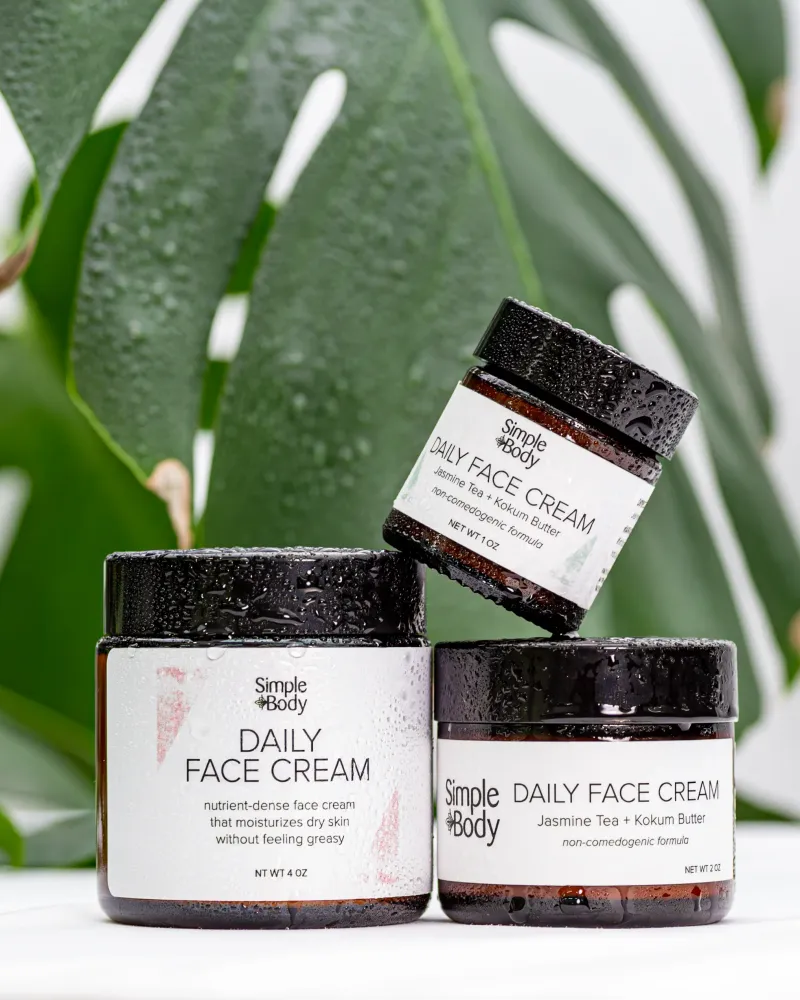
Product Photography for Simple Body: 2,500+ Images Across 16 Months of Seasonal Campaigns
2,500+ professional images across 75+ products and 16 months of seasonal campaigns
 Featured
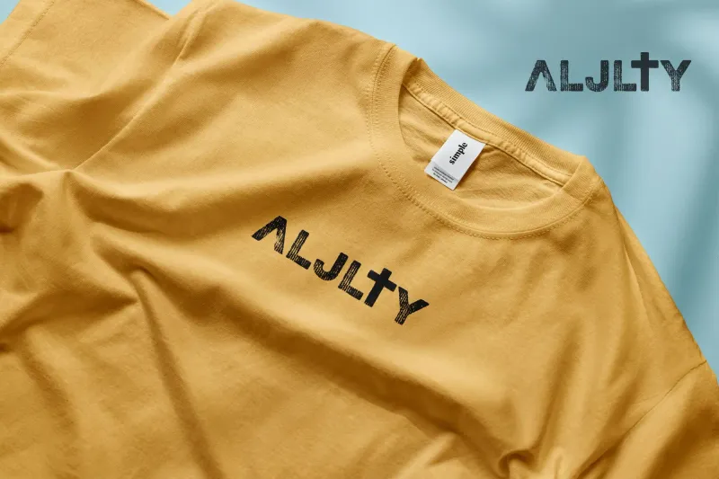
Building a Faith-Driven Apparel Brand from Five Letters
Complete brand identity, apparel line, and e-commerce store launched from scratch


