On this page
Privageo helps organizations navigate the regulatory maze of data privacy, security, and compliance. They offer fractional DPO and CISO services. They partner with platforms like OneTrust, Securiti, and Exterro. Their team includes deep expertise across CCPA, GDPR, and a dozen other frameworks most business owners have never heard of.
Their old website told none of that story.
The Problem: Expertise That Was Invisible Online
Privageo had a website. It functioned. Pages loaded. A contact form existed. But nothing about the site communicated the depth of what they actually do.
Data privacy consulting is a trust-first industry. Organizations hiring a fractional Chief Privacy Officer or a CISO need to believe, within seconds, that the firm they’re evaluating understands the complexity they’re drowning in. A generic-looking website doesn’t earn that belief.
Here’s what Privageo was up against:
- Prospects couldn’t tell them apart from competitors. The old site looked like a template because it was one. No personality. No positioning. Nothing that said “these people live and breathe privacy regulation.”
- The site didn’t reflect their methodology. Privageo operates on a clear three-phase model: Discover, Build, Manage. That framework is central to how they sell and deliver. The old site never communicated it.
- No lead qualification. Every inquiry came through the same generic contact form. A Fortune 500 compliance officer and a small business owner with a basic question both landed in the same inbox with zero context.
The gap between Privageo’s actual capability and how their website represented them was costing credibility with every visit.
The Insight: Trust Is a Design Decision
Before opening any design tool, I spent time understanding how Privageo’s prospects actually evaluate firms like theirs.
Data privacy buyers are cautious by nature. They deal with risk all day. They scrutinize everything. If a consulting firm’s own website feels disorganized or generic, that’s a red flag. If a firm that promises to “cut through the noise” has a noisy, confusing site? That contradiction registers immediately, even if the visitor can’t articulate why.
The insight was this: the website itself needed to be proof of the service. Clear structure. Confident positioning. A visual system that signals authority without being cold or corporate. Every section needed to demonstrate the same methodical thinking Privageo brings to their client engagements.
This is the difference between web design as decoration and web design as positioning. The site isn’t a brochure. It’s the first consulting experience a prospect has with Privageo.
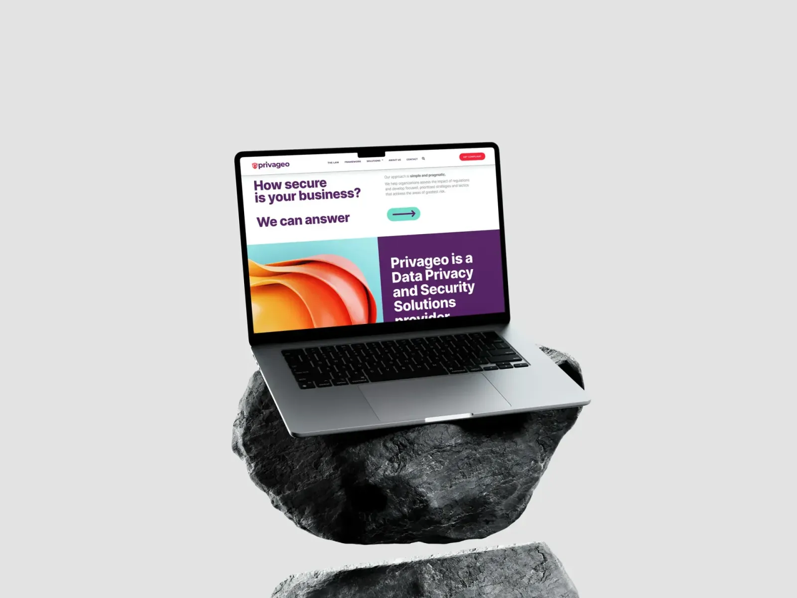
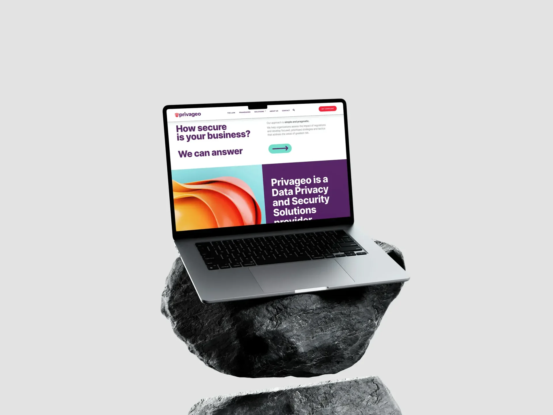
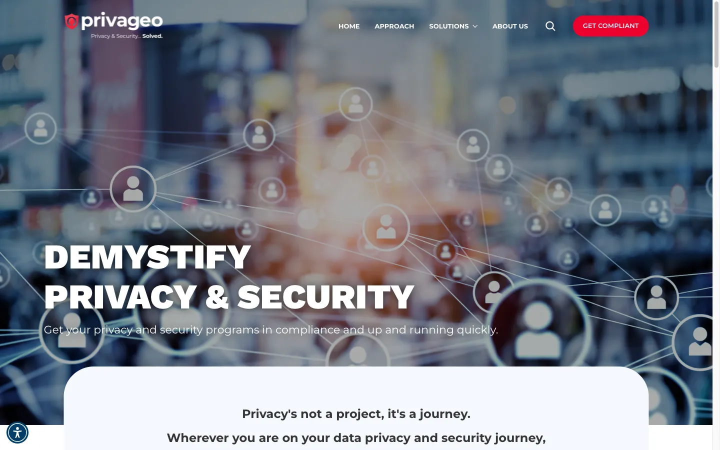
 Homepage hero: Bold, confident, and immediately clear about what Privageo does. No jargon. No ambiguity.
What I Built
Brand Identity System
I designed Privageo’s complete brand identity from scratch. The color palette uses deep red, navy blue, and purple as primary colors, with green as an accent. Those aren’t arbitrary choices.
Red signals urgency and importance (appropriate for compliance deadlines). Navy blue communicates trust and stability. Purple bridges the two, reinforcing the idea that Privageo operates at the intersection of security (technical) and privacy (strategic). The green accent marks positive actions and completed milestones.
The typography system pairs Work Sans for headings (bold, modern, authoritative), Montserrat for body copy (clean and readable at any size), and Poppins for labels and UI elements. Three fonts, each with a specific job.
The logo incorporates a shield icon with the tagline “Privacy & Security… Solved.” Direct. Confident. No fluff.
Website Design: Structure That Sells

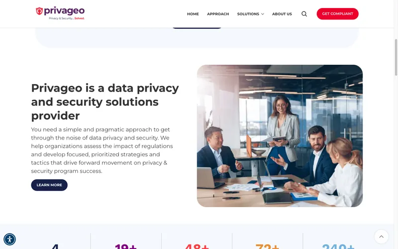
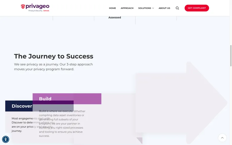
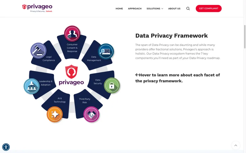
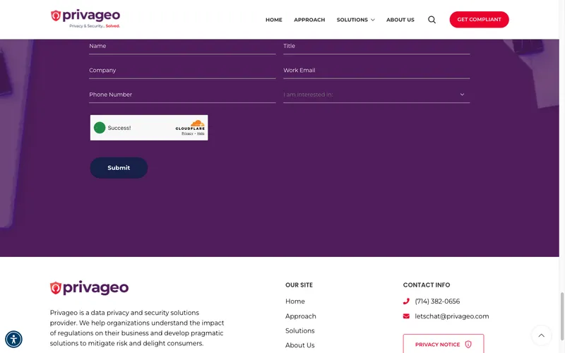
The site architecture mirrors how Privageo actually works with clients. That’s deliberate. Here’s what each section does:
Navigation with purpose. The top nav includes Home, Approach, Solutions (dropdown), About Us, and a red “Get Compliant” CTA button. The Solutions dropdown organizes their offerings into privacy, security, and discovery categories, so visitors self-select based on their specific need.
The Journey to Success section. This is the centerpiece. Three stacked, interactive blocks (Discover, Build, Manage) that walk prospects through Privageo’s methodology before they ever pick up the phone. It’s education-first UX. By the time a visitor reaches the contact form, they already understand how Privageo works.
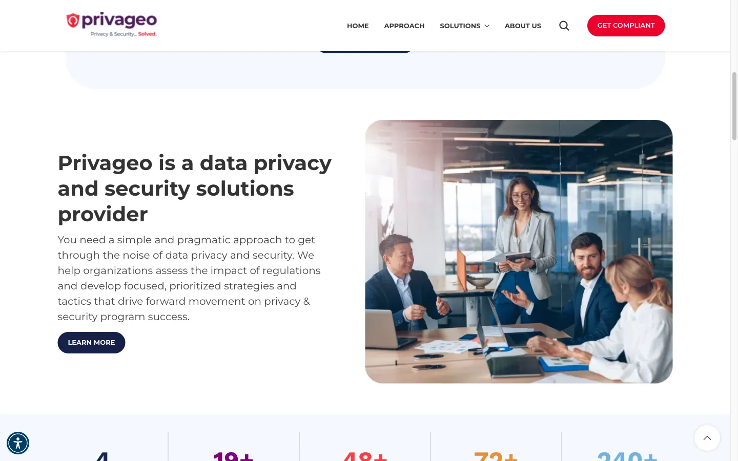 Company overview section: Statistics, team imagery, and a clear description of what Privageo does. No filler.
Problems We Solve section. Instead of listing services as bullet points, this section names the actual pain points prospects are dealing with: right-sizing privacy operations, creating risk-based roadmaps, empowering management to reduce risk. Nine specific problems, each with a colored check icon. When a CISO reads “right-size your privacy operation to save money,” they recognize their own situation.
Partner credibility strip. OneTrust, Securiti, Exterro, TruYou, MineOS logos displayed prominently. For this audience, technology partnerships are a major trust signal. A Fred Wilson quote on privacy anchors the section with third-party authority.
The Contact Form: Built to Qualify
This is a detail most designers skip. Instead of a generic “send us a message” form, I built a contact form with structured fields: Name, Title, Company, Work Email, Phone Number, and an “I am interested in” dropdown.
That dropdown is doing heavy lifting. Before a prospect even submits, they’ve categorized their own need. Privageo’s team can prioritize and route inquiries before the first reply. A Director of Compliance selecting “Privacy Assessment” gets a different response than a startup founder selecting “General Inquiry.”
Cloudflare Turnstile handles bot protection without the friction of reCAPTCHA puzzles.
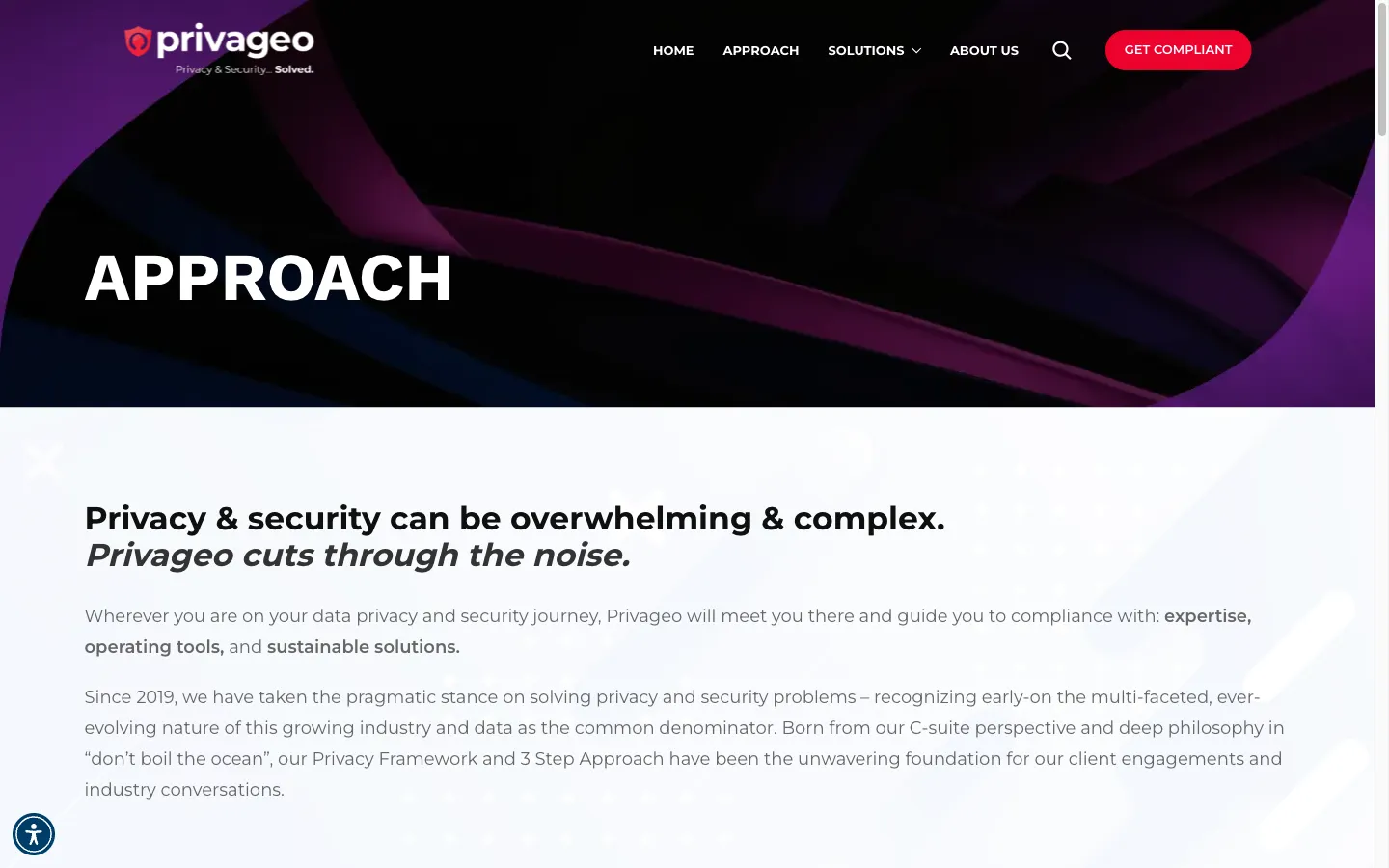 Approach page: Privageo’s philosophy and methodology presented with confident, direct copy and bold visual hierarchy.
Responsive Design
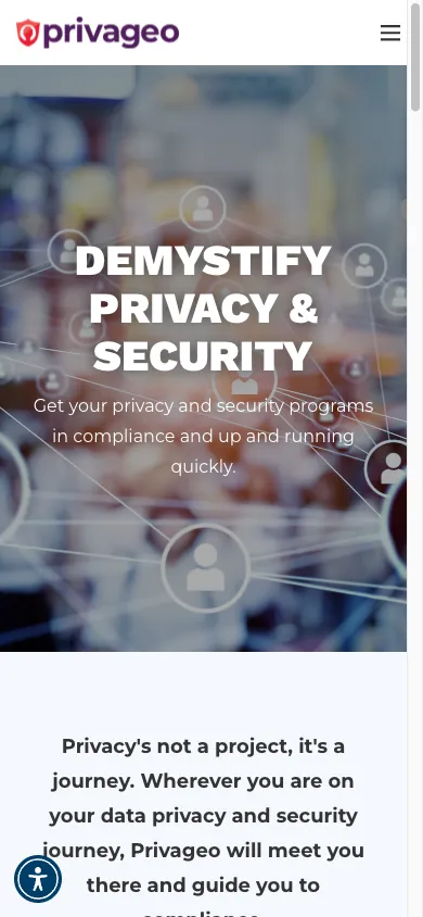
Every section works on mobile. The three-phase Journey section stacks vertically. The Problems We Solve grid reorganizes into a single column. The contact form fields stack naturally. The navigation collapses into a clean mobile menu.
This matters because compliance officers and CISOs often do initial research on their phones between meetings. If the mobile experience is clunky, they move on.
The Result
I can’t give you traffic charts or conversion percentages for this project. That’s not how I work. I don’t fabricate numbers, and Privageo hasn’t shared analytics data with me.
What I can tell you is what the site now delivers:
Positioning. Privageo’s website now communicates, within seconds, that this is a serious privacy and security consulting firm. Not a one-person operation. Not a reseller. A firm with methodology, partnerships, and industry depth.
Lead qualification. The structured contact form, interest dropdown, and title/company fields mean Privageo knows who’s reaching out and what they need before the first conversation.
Brand consistency. The color palette, typography, and visual language carry across every page. When Privageo shows up at the California Privacy Summit or hosts an industry happy hour, their digital presence matches their in-person authority.
Education-first experience. Prospects learn the Discover, Build, Manage framework before they ever talk to a salesperson. They arrive at the first call already understanding Privageo’s approach. That shortens sales cycles.
A website that makes a startup look like an industry leader. That’s the result.
About This Project
Frequently Asked Questions
That's Privageo's actual methodology, not a design concept I invented. The site mirrors how they deliver work. When the website's structure matches the sales conversation, prospects arrive at the first call already understanding the process. It reduces friction and builds confidence before any proposal is written.
Navy blue signals stability and trust. Deep red signals urgency (think compliance deadlines). Purple bridges the two, positioning Privageo at the intersection of technical security and strategic privacy consulting. Green marks positive outcomes and completed actions. Each color has a job. Nothing is decorative.
Privacy and security consulting covers a wide range of needs. A Fortune 500 compliance officer looking for a fractional DPO and a small business owner asking about CCPA basics have completely different timelines and budgets. The interest dropdown lets Privageo's team prioritize and route inquiries before the first reply. It's lead qualification built into the form design.
In data privacy consulting, your technology partnerships are proof of competency. OneTrust, Securiti, and Exterro are platforms that enterprise compliance teams actually use. Displaying those partnerships prominently tells prospects: 'We work with the tools your team already relies on.' For this audience, that's more persuasive than any headline.
Absolutely. The approach here, building design around the firm's actual methodology and letting the site educate before it sells, works for any consulting business where trust matters more than price. Accounting firms, cybersecurity consultancies, management consulting, legal advisory. The specifics change, but the principle holds: your website should feel like a preview of what it's like to work with you.
A combined brand identity and website design project typically takes 8-12 weeks, depending on the number of pages, revision rounds, and how quickly feedback happens. Brand identity (color, typography, logo) comes first. The website design builds on that foundation. Rushing either stage leads to a site that looks fine but doesn't actually position the business correctly.
Not Ready Yet?
No pressure. Here’s how to think about whether your consulting firm’s website is working for you or against you.
Warning signs your site is costing you credibility:
- Prospects mention your website looks “different” from what they expected after meeting you in person
- You’re spending time in sales calls explaining things your website should have already communicated
- Your inquiry form gives you zero context about what the prospect actually needs
- Competitors with less expertise have sites that look more established than yours
- You avoid sharing your website link with potential referral partners
Questions to answer before we talk:
- What’s the gap between how your firm is perceived and how good you actually are?
- Do your current leads arrive educated about your approach, or do you start from scratch every call?
- Is your site generating the right type of inquiries, or just volume?
When you’re ready:
I’m happy to take an honest look at whether a website design and branding project makes sense for your situation. Some firms just need a refresh. Some need to rebuild from the foundation. I’ll tell you which, and I’ll be straight about what’s actually worth the investment.
Project Gallery



Case study by
Kristian Kreaktive
Founder & Lead Strategist at Digital Marketing Services
17+ years of experience helping small businesses grow their online presence through strategic SEO, web design, and branding.

In collaboration with
eSEO Space
Design & Development
This project was created in collaboration with eSEO Space, combining our strategic approach with their technical expertise to deliver exceptional results.
Learn more about our partnershipMore Branding Success Stories

When the Logo Tells the Whole Story: Clean Cut Renovations
One logo concept that expanded into a complete brand identity and custom website
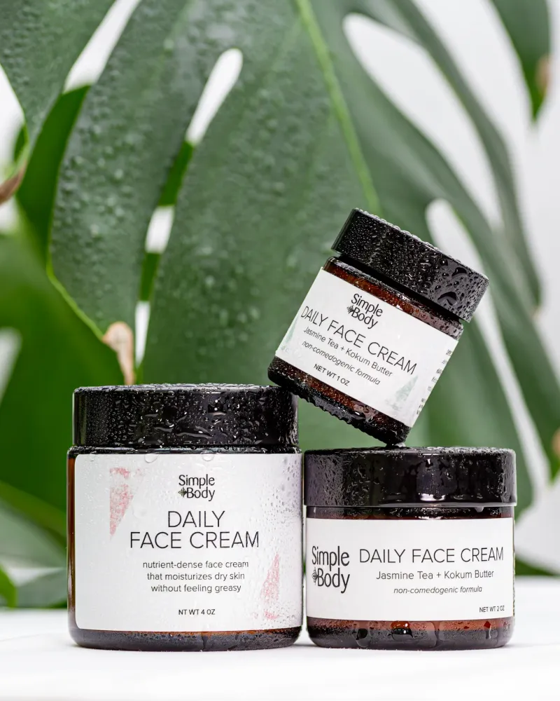
Product Photography for Simple Body: 2,500+ Images Across 16 Months of Seasonal Campaigns
2,500+ professional images across 75+ products and 16 months of seasonal campaigns
 Featured
Building a Faith-Driven Apparel Brand from Five Letters
Complete brand identity, apparel line, and e-commerce store launched from scratch
