
On this page
Sakaldi is an energy and telecom consulting firm based in Bilbao, in Spain’s Basque Country. They help businesses navigate two of the most complex purchasing decisions a company faces: energy procurement and telecommunications infrastructure.
These are industries where the wrong choice costs real money. Businesses need advisors they trust. And trust starts with how you present yourself.
The company had been operating for years. The work was solid. The client relationships were strong. The reputation in the Basque Country was growing. But the brand wasn’t keeping pace with any of it.
When you’re sitting across the table from a company’s leadership, advising them on energy contracts worth tens of thousands of euros, you need to look like someone who belongs in that room. Sakaldi’s existing visual identity wasn’t doing that job. It looked like a startup when the company had years of expertise behind it.
The Numbers That Matter
| What We Delivered | The Result |
|---|---|
| Project Type | Complete rebrand |
| Industry | Energy & Telecom Consulting |
| Location | Bilbao, Basque Country, Spain |
| Key Deliverables | Logo system, color palette, brand guidelines, office signage, marketing materials |
Works Well For: Is This Case Study Relevant to You?
This case study is most relevant if you:
- Run a consulting or professional services firm that needs to look credible with enterprise clients
- Operate across multiple industries and need a brand that bridges them without confusing anyone
- Want personal meaning baked into your brand without it looking like a family crest
- Need environmental or office branding that makes a strong first impression on visitors
- Have outgrown your original identity and need a visual system that matches where your business is now
Industry fit:
- Energy, utilities, and infrastructure companies
- Telecom and technology consultancies
- Professional services firms competing for enterprise contracts
- Multi-sector businesses that need a unified visual language
- Any company where credibility determines whether you get the meeting
The Problem: Consulting Expertise, Starter Brand
Sakaldi had the knowledge and the track record in energy and telecom consulting. What they didn’t have was a visual identity that matched.
Two industries, one company. Energy and telecom are fundamentally different worlds. Different clients, different terminology, different expectations. The brand needed to unify both sectors under one identity without favoring one or confusing potential clients about what Sakaldi actually does. A logo that looked too “energy” would alienate telecom prospects, and vice versa.
Competing for bigger contracts. In consulting, perception matters as much as capability. When you’re pitching alongside firms with polished, professional identities, showing up with an outdated brand puts you at a disadvantage before you even open your mouth. The decision-makers Sakaldi wanted to reach expected a certain level of visual professionalism. The existing brand wasn’t meeting that bar.
The gap between reputation and presentation. Sakaldi’s clients knew how good they were. But new prospects had no way of seeing that from the outside. The brand told a story that didn’t match the reality of the business. That mismatch was costing them opportunities.
The owner wanted it personal. This wasn’t just a business exercise. The owner wanted the brand to carry something meaningful: the initials of his wife Marta and daughter Sandra. M and S, woven into the identity. Not as a decorative afterthought, but as the foundation of the entire mark.
That last request is the kind of challenge I live for. Take something deeply personal and make it professional enough to command respect in a boardroom.
The Insight: Hidden Letters, Fresh Energy
Before any design work, I dug into what Sakaldi actually needed from their brand. Not what it should look like (that comes later), but what job it needed to do.
The brand had to work in two very different contexts. Energy clients needed to see stability and forward-thinking. Telecom clients needed to see connectivity and technical competence. And both groups needed to feel they were working with experienced professionals, not a startup finding its footing.
The design brief crystalized into two clear requirements. The logo needed to contain the letters M and S. And the color had to be a “fresh green.”
Personal meaning in a corporate logo is a tightrope. Push too hard and it looks like a monogram on a bathrobe. Too subtle and nobody notices. The goal was to embed both letters in a way that feels intentional to those who know, and simply reads as a strong mark to everyone else.
I started sketching. A lot.
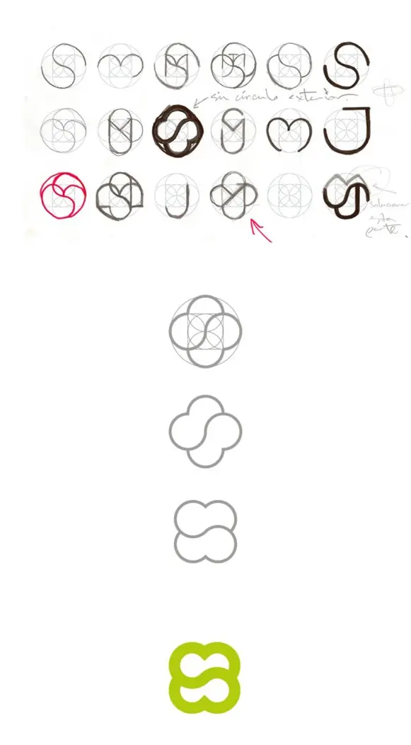
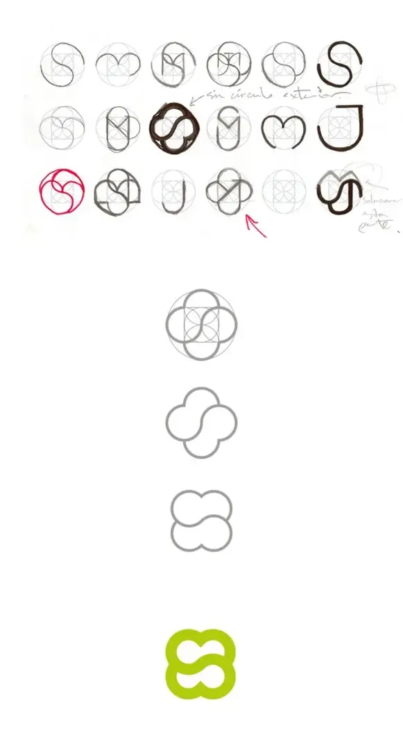 The exploration: 20+ variations finding the right way to merge M, S, and organic energy into one mark
The process image tells the real story. Three rows of hand-drawn explorations at the top, each one testing a different approach to embedding the letters inside circular, interconnected forms. Some explored the S as a dominant shape with M implied. Others started with the M and tried to weave in the S. A few went completely abstract, hoping the letters would emerge naturally.
Notes in the margins track decisions: “sin circulo exterior” (without the outer circle), arrows pointing to promising directions, circles highlighting the versions that were getting closer.
Early versions were too literal. Some looked like pretzels. Others were technically correct but visually heavy. A few were elegant but lost the letter recognition entirely.
The breakthrough came when I stopped trying to make the letters obvious and instead let them emerge from the overall shape. The middle section of the process shows the shift: construction circles becoming simpler, the form becoming more organic, the geometry becoming invisible underneath a shape that just feels right.
The final form uses four overlapping circles arranged so the negative space between them reads as an S from one angle and the upper lobes form an M from another. It’s geometry with soul. The construction is precise, but the result feels natural.
What I Actually Built
The Logo: Personal Meaning, Professional Presence
The final mark is built from overlapping organic loops that form both an M and an S. The shape feels like energy in motion: flowing, connected, continuous. It reads as an abstract symbol to most people, but the letters are there for those who know where to look.
The construction is geometric (circles and intersections) but the result feels organic. That contrast was intentional. Energy and telecom are technical industries, but Sakaldi’s strength is the human consulting relationship. The mark needed to feel approachable, not cold.
There’s also a secondary reading that works in Sakaldi’s favor. The interconnected loops suggest connection, flow, and continuity. In energy, that evokes power distribution and sustainable cycles. In telecom, it suggests networks and connectivity. Neither interpretation is forced, both are natural. That’s the sign of a mark that works.
Color Palette: Fresh Green Energy
The owner wanted “fresh green,” and I took that direction seriously. The primary logo color is a bright lime/yellow-green that feels alive and forward-looking. It’s not the dark, institutional green of traditional energy companies. It’s the green of new growth, renewable energy, and forward momentum. It references sustainability without spelling it out.
The wordmark uses a deep teal that provides contrast and grounds the energetic green. Together, they balance warmth and professionalism. The green says “we’re about the future of energy.” The teal says “and we know what we’re doing.”
Against white backgrounds, the combination is striking without being aggressive. It stands out in a boardroom presentation or on a business card without looking like it’s trying too hard.
 The brand in context: Sakaldi’s positioning in renewable energy and sustainability
Typography
“Sakaldi” in a clean, modern sans-serif with “ENERGY & TELECOM” as spaced small caps underneath. The type hierarchy immediately communicates two things: company name, then what they do. No ambiguity.
The small caps treatment for the subtitle gives it presence without competing with the company name. It also creates a visual bridge between the organic logo mark above and the structured text below. The spacing between the letters in “ENERGY & TELECOM” is intentionally wide, giving the words room to breathe and adding a sense of polish that tight tracking wouldn’t achieve.
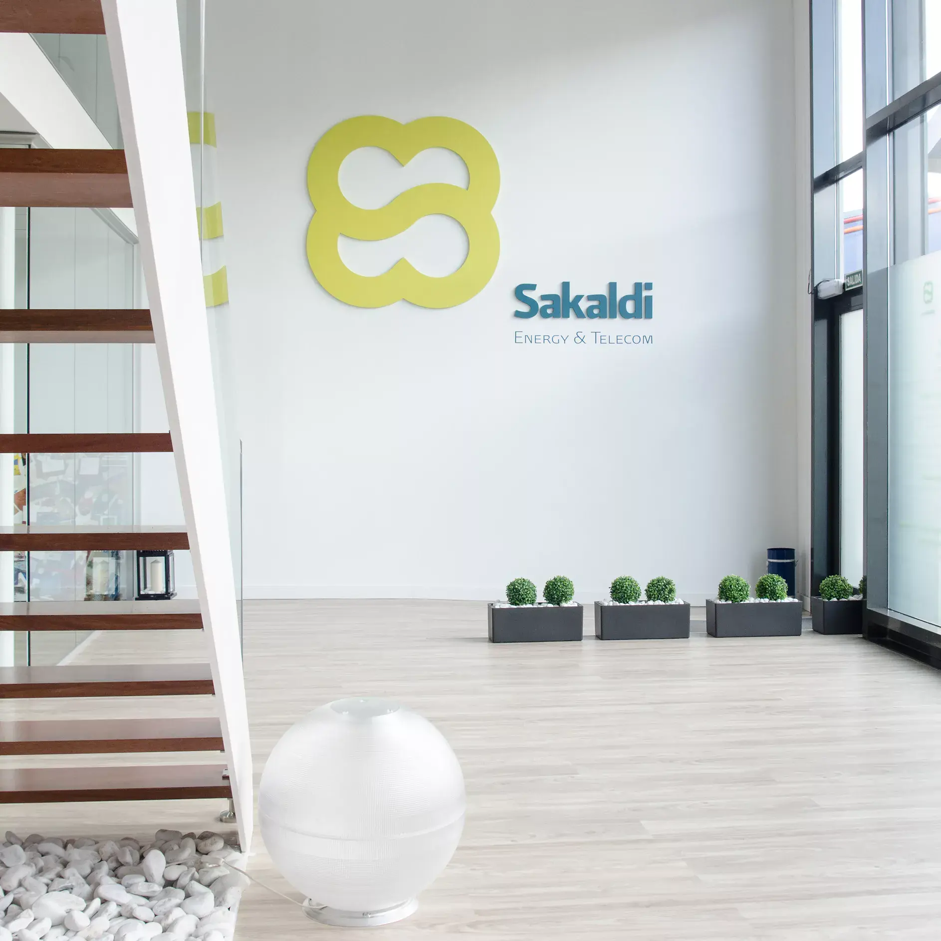
Office Signage: The 3D Wall Installation
This is where the brand comes to life. Design on screen is one thing. Design in physical space tells you whether it actually works.
The logo was fabricated as a dimensional wall-mounted sign for Sakaldi’s office reception in Bilbao. The mark is rendered in the signature yellow-green, mounted on the white double-height wall of the entrance.
 The finished installation: 3D logo in Sakaldi’s Bilbao office
The space itself supports the brand perfectly. Modern wooden stairs with clean white stringers. White river stones as decorative ground cover. Dark rectangular planters with green boxwood spheres that echo the brand palette. A spherical floor lamp adds a contemporary touch.
Everything in the reception communicates the same message: modern, clean, professional, alive. The dimensional logo is the centerpiece, but it works because the environment reinforces it. When clients walk in for a meeting, the brand sets the tone before anyone says a word.
That’s the difference between a logo file and a brand identity system. The logo is the mark. The system is how every touchpoint, physical and digital, tells a consistent story.
The Result: A Brand That Opens Doors
The new identity gave Sakaldi what they were missing: a professional presence that matched their consulting expertise.
The M and S are embedded in every piece of material they hand out, every presentation they deliver, every wall visitors see when they walk in. A private detail that carries family meaning through every business interaction. The owner knows Marta and Sandra are part of every pitch, every contract, every meeting. Most clients will never notice the hidden letters. But for the Sakaldi family, they’re always there.
More importantly, the brand helped them compete at a higher level. When you look the part, you get invited to pitch for bigger contracts. When your materials match your expertise, prospects trust you faster. When your office makes the right first impression, conversations start from a position of credibility instead of having to prove it.
That’s exactly what happened. A professional look that opened doors to bigger contracts.
Common Questions
Frequently Asked Questions
Yes, and it's one of my favorite challenges. The key is subtlety. The personal element should feel intentional to those who know, and simply look like strong design to everyone else. With Sakaldi, the M and S for Marta and Sandra are embedded in the organic loops of the mark. Most people see an abstract energy symbol. The family sees their initials.
By finding the common thread. Energy and telecom are different industries, but Sakaldi's value is the same in both: expert consulting that saves clients money and complexity. The brand needed to communicate 'trusted advisor' more than 'energy company' or 'telecom company.' The abstract logo mark does exactly that, while the subtitle clarifies the sectors.
Absolutely. Sakaldi is based in Bilbao, Spain. Brand identity work translates across borders because the fundamentals are the same: understand the business, understand the audience, build a visual system that connects them. Time zones and language differences are logistics, not obstacles.
Dimensional signage makes a physical impression that flat graphics can't match. When clients visit Sakaldi's Bilbao office, the 3D wall-mounted logo is the first thing they see. It communicates permanence, investment, and pride. For a consulting firm where in-person meetings drive business, that first impression directly affects how clients perceive your credibility.
For Sakaldi, I went through over 20 hand-drawn explorations before landing on the final direction. That's not unusual for projects with specific requirements like hidden letterforms. The process image in this case study shows the real journey from loose sketches to geometric refinement to the finished mark. Thorough exploration is how you avoid settling for 'good enough.'
Not Ready Yet?
That’s fine. Here’s how to know when branding becomes a priority.
Signs you need brand help:
- You’re losing pitches to firms that aren’t better than you, just better-looking
- Clients seem surprised by your capability after meeting you (they expected less based on your materials)
- You’re expanding into new markets or industries and your current identity feels too narrow
- You want personal or family meaning reflected in your brand but don’t know how to do it professionally
- Your office or workspace doesn’t match the caliber of work you deliver
Questions to answer before we talk:
- Who are your ideal clients, and what do they expect visually?
- Are you competing in one industry or bridging multiple sectors?
- What’s the gap between how you’re perceived and how good you actually are?
- Is there personal meaning you want embedded in your brand?
When the timing is right:
I offer a free brand consultation. No obligation, no pressure. Just an honest look at whether branding investment makes sense for your specific situation.
Some businesses don’t need a rebrand. They need better marketing with what they have. I’ll tell you that honestly.
But if your brand is actively holding you back from the contracts you deserve, a conversation will clarify what fixing it would look like.
Project Gallery

Case study by
Kristian Kreaktive
Founder & Lead Strategist at Digital Marketing Services
17+ years of experience helping small businesses grow their online presence through strategic SEO, web design, and branding.
More Digital Marketing Clients from Bilbao
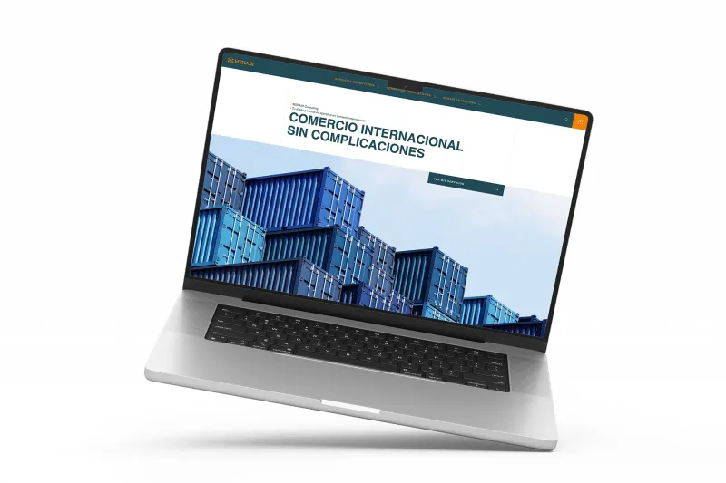
How 50 Monthly Searches Turned Into a Fully Booked Consulting Business
From zero online presence to fully booked in 6 months, zero ad spend
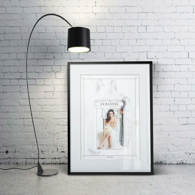
Brand Identity and Editorial Photography for a Debut Bridal Collection
A debut bridal collection launched with a complete brand identity and editorial portfolio
Luxe Brand Identity and Visual System for High-End Retail Store
Customers now expect to pay more, and they do
More Branding Success Stories
When the Logo Tells the Whole Story: Clean Cut Renovations
One logo concept that expanded into a complete brand identity and custom website

Product Photography for Simple Body: 2,500+ Images Across 16 Months of Seasonal Campaigns
2,500+ professional images across 75+ products and 16 months of seasonal campaigns
 Featured
Building a Faith-Driven Apparel Brand from Five Letters
Complete brand identity, apparel line, and e-commerce store launched from scratch


