
On this page
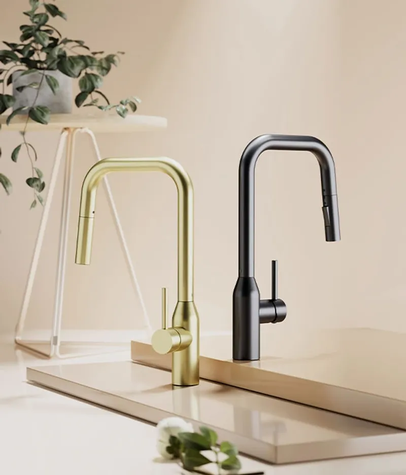
Tasoro Products supplies interior finishes for multifamily construction and renovation projects. Bathroom fixtures, kitchen components, cabinetry, flooring, doors, lighting. They source directly from top factories worldwide and sell at wholesale prices to owners, operators, and contractors.
Their old website was actively losing them business.
Updated February 2026: Eight months after launch, I pulled fresh SEMrush data to check the organic recovery. The site now holds multiple page-1 rankings for high-value product keywords, with 240+ terms in the ranking portfolio. Updated keyword rankings and traffic data below.
The Numbers That Matter
| What We Delivered | The Result |
|---|---|
| Product Categories | 6+ categories organized by room type for intuitive browsing |
| Markets Served | Multifamily, residential, and hospitality industries |
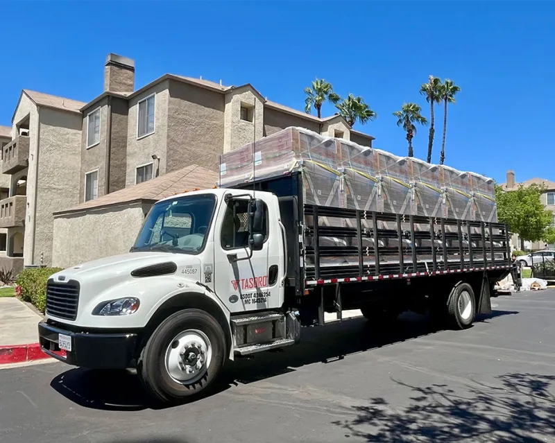
| Locations | Gardena (LA metro) and San Diego warehouses |
| Organic Recovery | 240+ organic keywords (up from 22 after algorithm hit), multiple #1 rankings |
Works Well For: Is This Case Study Relevant to You?
This case study is most relevant if you:
- Sell physical products B2B and need your website to generate quote requests, not just display inventory
- Compete in a commoditized market where every competitor’s website looks identical
- Have a product catalog that’s hard to browse and doesn’t lead visitors toward action
- Serve professional buyers (contractors, property managers, developers) who evaluate suppliers online before picking up the phone
- Got hit by a Google algorithm update and need a website that can recover and build organic authority
Industry fit:
- Building materials and construction supply
- Industrial distribution and wholesale
- Manufacturing with direct-to-business sales
- Any B2B product company where the website is the first sales conversation
The Company: Built by Investors Who Understood the Problem
Tasoro was founded by apartment investors who got tired of overpaying for building materials. Ten years ago, they brought construction and materials procurement in-house for their own renovation projects. They sourced the top factories globally, found the same quality as premium brands at significantly lower prices, and realized other property operators and contractors had the same problem.
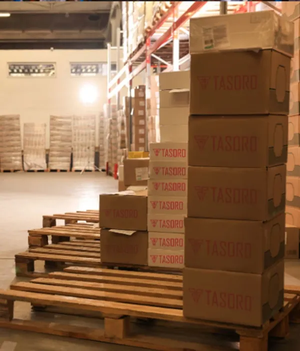
That insight became Tasoro: high-quality interior finishes at wholesale pricing, with services most suppliers don’t offer. Customized kitting (materials pre-sorted by unit type), pre-order budgeting, warehousing, and nationwide onsite delivery.
Their customers include names like Equity Residential and Strata Equity Group. Real companies managing thousands of units.
The Challenge: Every Supplier Website Looks the Same
Walk through the building materials supplier space online and you’ll notice something: they all look identical. Generic product grids. Stock photography. Walls of text that nobody reads. Contact forms buried three clicks deep.
Tasoro’s old website had the same problem. It functioned, but it didn’t differentiate. Here’s what I found:
Navigation was a dead end. Visitors couldn’t browse products intuitively by room type or use case. A property manager looking for a complete bathroom renovation package had to hunt through unrelated categories to piece together what they needed.
No lead generation path. The site displayed products but gave visitors no clear reason to request a quote. There was no savings calculator, no comparison tool, no structured path from “I’m browsing” to “I need a quote.” Visitors came, looked, and left.
The algorithm hit sealed it. In mid-2024, Google’s core update crushed Tasoro’s organic traffic from 900 monthly visits to 91. The old site’s thin content and poor structure couldn’t survive the quality bar Google was raising. Something had to change.
The Insight: Suppliers Don’t Lose Deals on Price. They Lose Them on Experience.
Before touching any design tool, I studied how Tasoro’s buyers actually work. Property managers and contractors evaluating a building materials supplier aren’t shopping on Amazon. They’re comparing two or three suppliers, usually while managing active renovation projects.
They want three things: Can I see what you carry? Can I estimate what this costs? Can I talk to someone quickly?
Every supplier has competitive pricing. Every supplier claims quality products. The differentiator is the experience of working with you, and that experience starts on the website.
The insight: design the website as a preview of Tasoro’s actual service. Organized, professional, easy to work with. If the website feels smooth and well-structured, buyers assume the ordering process will be too.


What I Built
I designed the complete UI/UX and information architecture within Tasoro’s existing brand identity (red, white, and neutral tones). eSEO Space handled the development.
Product Catalog Organized by How Buyers Think
Instead of a generic product grid, I organized the catalog by room type: Bathroom, Kitchen, Cabinets, Flooring, Doors, Lighting. That matches how contractors and property managers actually plan renovations. They don’t think in product categories. They think in rooms and units.
Each category opens into a clean product showcase with clear imagery and specifications. No clutter. A property manager renovating 200 bathroom units can see everything they need in one place.
The Savings Calculator
This was a key design decision. Tasoro’s biggest selling point is price. They offer the same quality as premium brands at wholesale cost. But “we’re cheaper” doesn’t convert on its own. Buyers need to see the math.
I designed a Comparison Quote tool that lets visitors calculate their potential savings against retail pricing. It turns an abstract value proposition (“we save you money”) into a concrete number (“you’ll save $14,000 on this project”). That specificity drives quote requests.
The “How It Works” Flow
Tasoro’s service model is unusual for a building materials supplier. Customized kitting, pre-order budgeting, end-to-end visibility, nationwide delivery. Most suppliers just sell products and ship them.
I designed a step-by-step “How It Works” section that walks visitors through the full service model. Eight distinct capabilities, each with its own icon and clear description. This section does two things: it educates buyers on what makes Tasoro different, and it builds confidence that ordering from Tasoro is structured and reliable.
Social Proof That Matters in B2B
I placed real testimonials from recognizable industry names (Equity Residential, Strata Equity Group) prominently on the homepage. In B2B building materials, who you work with matters more than what you claim. When a property manager sees that Equity Residential trusts Tasoro, that’s more persuasive than any headline.
Quote Request Flow
Every product category, every service description, every section on the site has a clear path to “Request A Quote.” Not buried. Not aggressive. Just present and obvious wherever a buyer might decide they want to talk.
The design uses a prominent red CTA button that carries through the entire site. Consistent, visible, and always within reach.
Design Decisions Worth Noting
Working within the brand. Tasoro had established brand guidelines (the red, the logo, the visual identity). My job was to make those guidelines work hard on the web. The red accent color became the primary action color across all CTAs. The clean, modern typography (Neue Haas Grotesk and Inter) reinforces professionalism without feeling cold.
Content architecture for SEO recovery. The old site’s thin content contributed to the algorithm hit. I designed the information architecture to support deeper, more useful content on every page. Product descriptions, service explanations, customer stories. Google rewards sites that genuinely help visitors. The new structure gives every page a reason to exist.
Mobile-first for field buyers. Contractors browse supplier websites from job sites on their phones. Every section, every product category, every CTA works on mobile. The savings calculator. The product galleries. The quote form. Nothing breaks, nothing hides.
The Results: What the Data Shows
I don’t fabricate metrics. Here’s what I can tell you based on real SEMrush data, most recently pulled in February 2026.
The recovery is real. After the algorithm hit dropped Tasoro from 900+ organic visits to 91 per month, the redesigned site has been climbing back. Organic keywords grew from a low of 22, peaked above 330, and currently sit at 241 after additional algorithm fluctuations. Monthly organic traffic holds steady in the 230-280 range.
The rankings tell the real story. Here’s where Tasoro ranks for high-value keywords as of February 2026:
| Keyword | Position | Monthly Searches |
|---|---|---|
| sliding mirror door | 1 | 590 |
| closet mirror doors sliding | 1 | 480 |
| mirrored sliding doors | 1 | 90 |
| wholesale faucets | 11 | 210 |
| curved rod shower | 12 | 8,100 |
| tub pan | 12 | 140 |
| wholesale kitchen faucets | 13 | 110 |
| wholesale bath accessories | 18 | 70 |
| door with mirror | 22 | 880 |
| double rocker switch | 28 | 590 |
| bath accessories distributor | 35 | 90 |
| wholesale bathroom faucets | 36 | 110 |
| rolling shower door | 39 | 140 |
| sliding mirror closet doors | 45 | 3,600 |
| mirrored sliding closet doors | 54 | 2,900 |
| mirror door | 55 | 1,900 |
| mirror closet doors | 59 | 5,400 |
Three things stand out. First, Tasoro owns multiple #1 positions for product-specific terms like “sliding mirror door” (590 monthly searches). Those are buyers actively looking for what Tasoro sells.
Second, the wholesale and B2B keywords are gaining traction. “Wholesale faucets” at position 11 and “wholesale kitchen faucets” at 13 mean Tasoro is starting to show up for the exact terms their target buyers use.
Third, the opportunity ahead is massive. Keywords like “mirror closet doors” (5,400 monthly searches) and “sliding mirror closet doors” (3,600 monthly searches) are already ranking on pages 2-3. Moving those to page 1 would transform Tasoro’s traffic.
The organic traffic cost tells the story. The estimated value of Tasoro’s organic traffic (what they’d pay for the same traffic in Google Ads) has recovered from near-zero to consistent monthly value. That’s free traffic replacing what would otherwise require paid spend.
Is the organic recovery complete? Not yet. But the site is ranking #1 for multiple product keywords, and the highest-volume terms are within striking distance of page 1. The foundation is built for continued growth.
About This Project
Frequently Asked Questions
Stop designing around products and start designing around how buyers actually work. Contractors and property managers don't browse product grids for fun. They need to find what they need, estimate costs, and request a quote. Organize around their workflow, not your inventory system.
It depends on why the hit happened. If the old site had thin content, poor structure, and weak user experience, a redesign that fixes those fundamentals gives Google a reason to trust the site again. That's what happened with Tasoro. The recovery isn't instant, but the trajectory shows the new structure is working.
Every supplier claims good prices. A calculator turns that claim into proof. When a property manager sees a specific dollar amount they'd save on their next renovation project, that's far more persuasive than 'competitive pricing' written in a headline. It also creates engagement: visitors who use a calculator are significantly more likely to request a quote.
Use real product photos whenever possible. Stock imagery signals that you're not confident in your own products. Tasoro had actual product photos, warehouse imagery, and real customer service photography. I used those throughout the design. Authenticity matters more than polish in B2B.
It depends on the business model. Tasoro operates on wholesale pricing that varies by project scope, so a 'Request A Quote' model makes sense. The savings calculator bridges the gap: visitors get a sense of cost savings without needing exact pricing on every product. For standard items with fixed pricing, show the price. Don't hide what buyers need to see.
I handled the design: how the site looks, how visitors navigate it, what content goes where, and how the user experience flows from browsing to quote request. eSEO Space handled the development: turning those designs into a working website with functioning calculators, forms, and product catalogs. Design defines the experience. Development makes it real.
This project took approximately 2-3 months from discovery through launch. Timeline depends on the complexity of the product catalog, how much content needs to be created or reorganized, and the feedback cycle with the client. Rushing design decisions leads to a site that looks fine but doesn't convert.
Not Ready Yet?
That’s fine. Here’s how to know when your supplier website becomes a business problem.
Warning signs your site is costing you deals:
- Competitors with worse products have better-looking websites
- Buyers tell you they found you through a referral, never through Google
- Your sales team spends calls explaining things the website should have already communicated
- You have no idea how many visitors request a quote versus how many just leave
- Your product catalog is organized by how you stock inventory, not how buyers shop
Questions to answer before we talk:
- How do your buyers currently find and evaluate you online?
- What’s the one thing about your company that your competitors can’t match?
- Is your website generating quote requests, or is it just a digital brochure?
- What happened the last time a potential customer visited your site for the first time?
When you’re ready:
I’m happy to take an honest look at your current site and tell you what’s working, what’s not, and what fixing it would cost. Some businesses need a complete redesign. Some need better product organization and a clear conversion path. I’ll tell you which applies to your situation.
The Bottom Line
Tasoro Products had a website that blended in with every other building materials supplier online. The old site couldn’t survive a Google algorithm update because it lacked the structure, content depth, and user experience that modern search engines demand.
The redesign gave them a site that works like their business works: organized, efficient, and focused on making it easy for buyers to get what they need. Products organized by room type. A savings calculator that turns price claims into proof. A quote request flow that’s always one click away.
The organic traffic is recovering. The keyword portfolio is rebuilding. The foundation is in place for sustained growth.
That’s what a focused website redesign delivers for a B2B supplier: not just a prettier site, but a platform that generates business.

Case study by
Kristian Kreaktive
Founder & Lead Strategist at Digital Marketing Services
17+ years of experience helping small businesses grow their online presence through strategic SEO, web design, and branding.
In collaboration with
eSEO Space
Design & Development
I designed the complete UI/UX and information architecture. eSEO Space, ranked #8 best web design agency in the world by Clutch, handled the development, turning my designs into a fast, responsive production site.
Learn more about our partnershipMore Digital Marketing Clients from Los Angeles
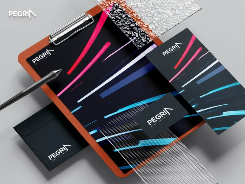
Brand Identity and Visual System for a Cybersecurity Firm
PegriaComplete brand identity and collateral for Pegria, a cybersecurity consulting and managed security firm in Los Angeles. Navigation-inspired logo, custom typography, and a kinetic visual system that makes a brand-new firm look enterprise-ready.
From zero brand to enterprise-ready identity in 3 weeks
More Web Design Success Stories
 Featured
How a CPA Firm Captured 991 Top-3 Google Rankings and 175 AI Overview Citations
991 keywords in top 3, 175 AI Overview citations
When the Logo Tells the Whole Story: Clean Cut Renovations
One logo concept that expanded into a complete brand identity and custom website
 Featured
Building a Faith-Driven Apparel Brand from Five Letters
Complete brand identity, apparel line, and e-commerce store launched from scratch


